SwiftUI – ColorPicker
In SwiftUI, the ColorPicker is a built-in control that allows users to select a color from a system-provided color picker interface.
It is a versatile and user-friendly component used in apps where color customisation is needed, such as themes, drawings, or design tools.
This tutorial will guide you through the usage of ColorPicker, including examples to customise and display the selected color in SwiftUI.
Syntax for ColorPicker
The basic syntax for creating a ColorPicker is:
ColorPicker("Label", selection: $color)Here:
"Label": A text label that describes the purpose of the color picker.$color: A binding to aColorvariable that holds the selected color.
SwiftUI automatically opens the system’s color picker UI when the control is tapped.
Examples of ColorPicker
Let’s explore how to use ColorPicker in various scenarios in SwiftUI.
Example 1: Basic ColorPicker
This example demonstrates a simple ColorPicker that lets users choose a color:
Code Example:
import SwiftUI

struct ContentView: View {
    @State private var selectedColor: Color = .blue

    var body: some View {
        VStack {
            ColorPicker("Pick a Color", selection: $selectedColor)
                .padding()

            Text("Selected Color")
                .foregroundColor(selectedColor)
                .font(.headline)
                .padding()
        }
    }
}
Xcode Screenshot:
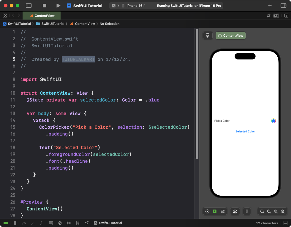
Explanation:
- The
ColorPickerallows users to choose a color, and the selected color is stored in theselectedColorstate variable. - The text color of the
Textview dynamically changes based on the selected color.
Result: A color picker control appears, and the selected color dynamically updates the text.
Example 2: ColorPicker with a Default Color
This example starts with a default color, allowing users to change it:
Code Example:
import SwiftUI

struct ContentView: View {
    @State private var chosenColor: Color = Color.green

    var body: some View {
        VStack {
            ColorPicker("Choose Your Favorite Color", selection: $chosenColor)
                .padding()

            RoundedRectangle(cornerRadius: 10)
                .fill(chosenColor)
                .frame(width: 200, height: 100)
                .overlay(Text("Selected Color")
                            .foregroundColor(.white)
                            .font(.headline))
        }
        .padding()
    }
}
Xcode Screenshot:
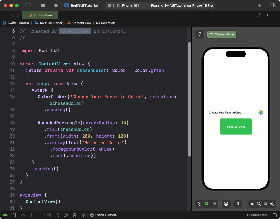
Explanation:
- The
chosenColorstate variable is initialized with a default color (Color.green). - The
ColorPickerupdates the color dynamically when a new color is selected. - A rectangle with rounded corners displays the currently selected color as a fill.
Result: The user can change the color, and the rectangle dynamically updates with the chosen color.
Example 3: ColorPicker in a Form
Here’s an example of using a ColorPicker in a SwiftUI form, commonly used for settings or preferences:
Code Example:
import SwiftUI

struct ContentView: View {
    @State private var backgroundColor: Color = .white

    var body: some View {
        Form {
            Section(header: Text("Customize Background")) {
                ColorPicker("Background Color", selection: $backgroundColor)
            }
        }
        .background(backgroundColor)
    }
}
Xcode Screenshot:
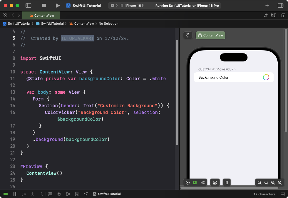
Explanation:
- The
ColorPickeris placed inside aForm, making it suitable for settings screens. - The
backgroundColorstate variable controls the form’s background color.
Result: A form containing a color picker that changes the form’s background dynamically.
Example 4: ColorPicker with Opacity
This example demonstrates how to allow users to select a color with opacity:
Code Example:
import SwiftUI

struct ContentView: View {
    @State private var selectedColor: Color = Color.black

    var body: some View {
        VStack {
            ColorPicker("Select Color with Opacity", selection: $selectedColor, supportsOpacity: true)
                .padding()

            Circle()
                .fill(selectedColor)
                .frame(width: 100, height: 100)
                .shadow(radius: 5)
        }
        .padding()
    }
}
Xcode Screenshot:
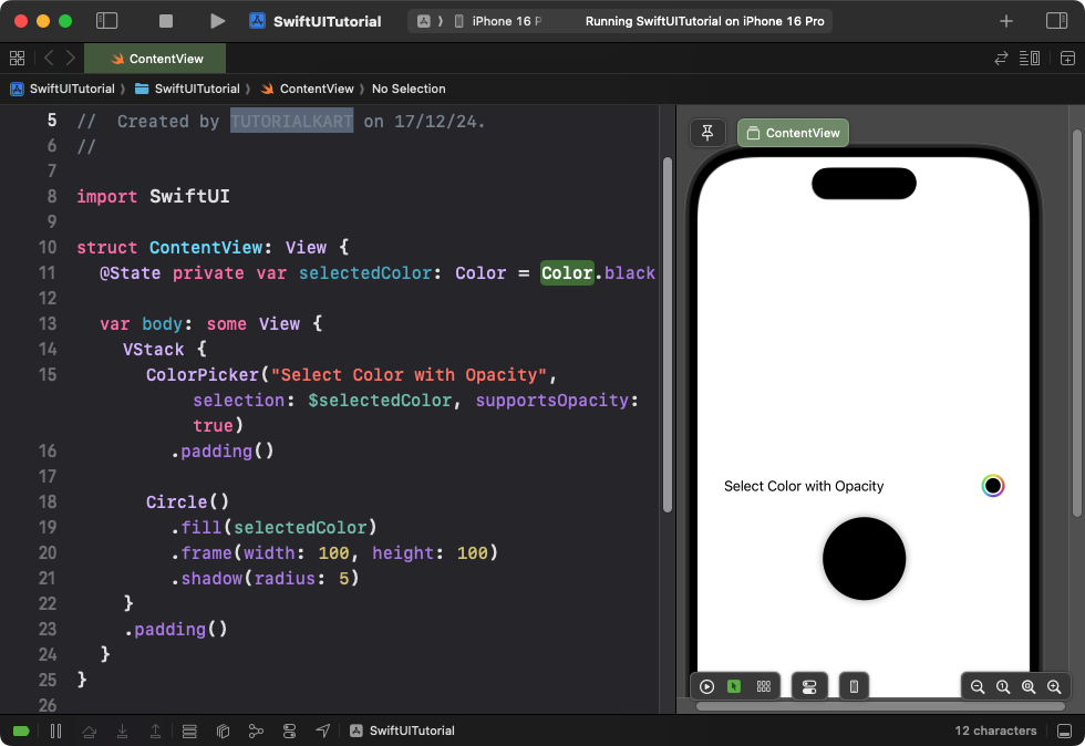
Explanation:
- The
supportsOpacity: trueparameter enables the opacity slider in the color picker. - The
Circleview reflects the selected color and its opacity.
Result: A color picker with an additional opacity slider for selecting transparent or semi-transparent colors.
Conclusion
The SwiftUI ColorPicker is a powerful and easy-to-use control for color selection. It allows users to select colors with or without opacity and can be integrated into forms, settings, or creative apps. Combined with other SwiftUI components, you can provide a highly interactive user experience.