SwiftUI – Toggle
In SwiftUI, the Toggle view provides a user interface element for enabling or disabling a feature or option. It represents a switch that toggles between two states: on and off. Toggles are often used in settings screens or forms to allow users to quickly make binary choices.
In this SwiftUI tutorial, we’ll cover the basic usage of Toggle, customisation options, and practical examples to help you incorporate toggles into your SwiftUI app.
Basic Syntax for Toggle
The basic syntax for creating a Toggle is:
Toggle("Label", isOn: $stateVariable)Here:
"Label": The text displayed next to the toggle switch.$stateVariable: A binding to a@Stateor@Bindingvariable that tracks the toggle’s state.
When the toggle is switched, the stateVariable is updated automatically.
Examples
Let’s explore some examples to understand how to use and customize Toggle in SwiftUI.
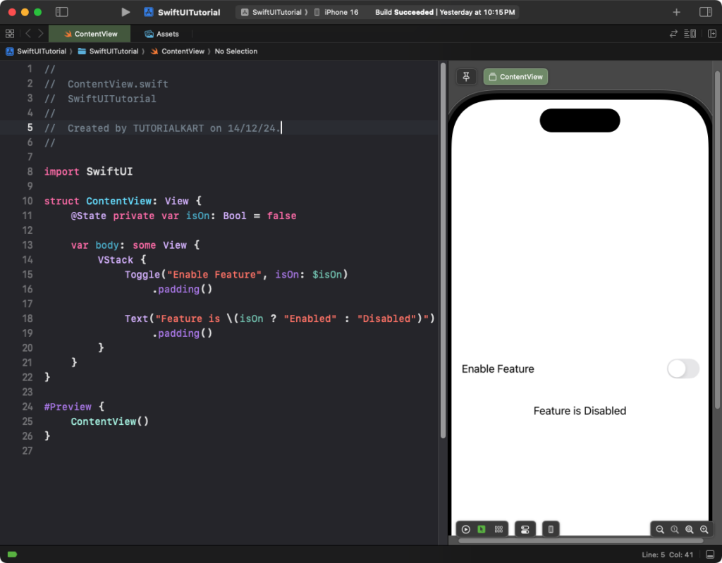
Example 1: Simple Toggle
This example demonstrates a basic toggle that tracks its state:
Code Example:
import SwiftUI

struct ContentView: View {
    @State private var isOn: Bool = false

    var body: some View {
        VStack {
            Toggle("Enable Feature", isOn: $isOn)
                .padding()

            Text("Feature is \(isOn ? "Enabled" : "Disabled")")
                .padding()
        }
    }
}
Explanation:
- The
isOnstate variable tracks whether the toggle is switched on or off. - The
Toggleupdates theisOnvalue automatically when toggled. - The
Textview reflects the current state dynamically.
Result: A toggle with the label “Enable Feature” is displayed. Switching it on or off updates the accompanying text dynamically.
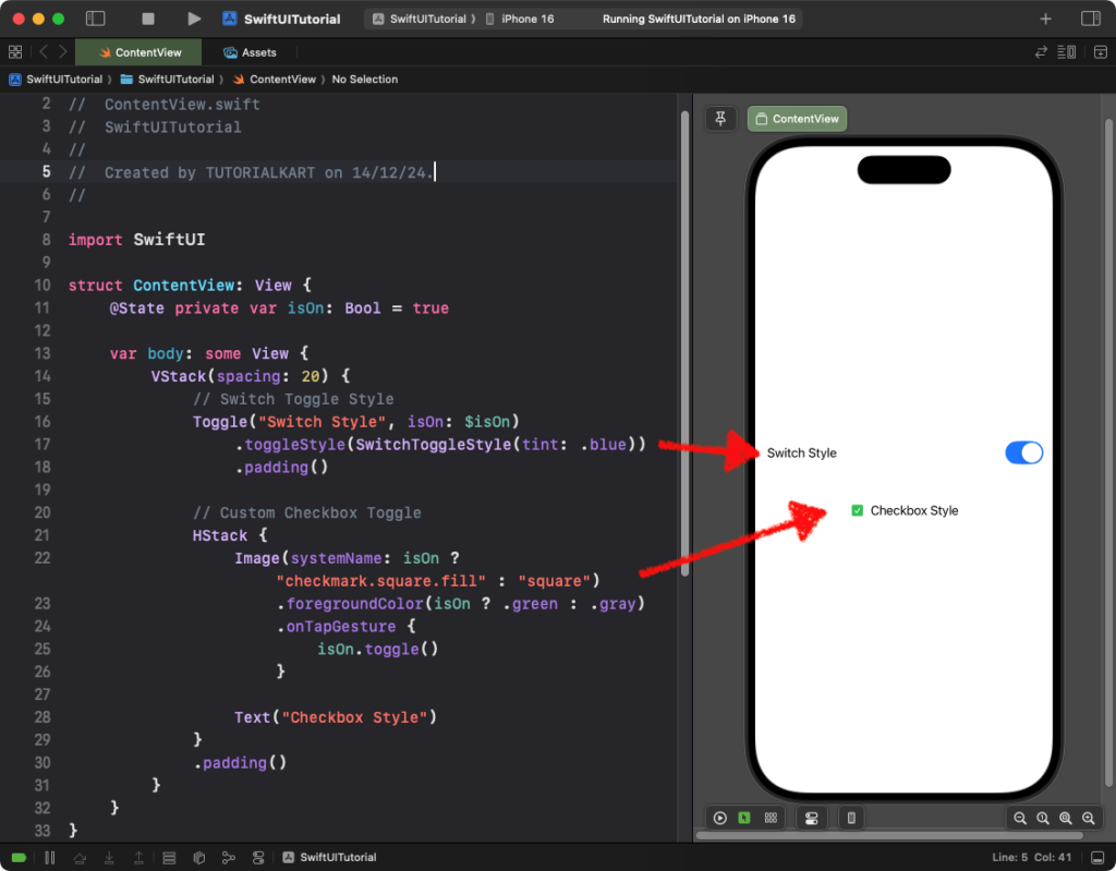
Example 2: Customizing Toggle Style
While iOS doesn’t support a native checkbox-style toggle, you can create a custom checkbox toggle using an HStack and Image. Below, we demonstrate both a switch-style toggle and a custom checkbox-style toggle.
Code Example:
import SwiftUI

struct ContentView: View {
    @State private var isOn: Bool = true

    var body: some View {
        VStack(spacing: 20) {
            // Switch Toggle Style
            Toggle("Switch Style", isOn: $isOn)
                .toggleStyle(SwitchToggleStyle(tint: .blue))
                .padding()

            // Custom Checkbox Toggle
            HStack {
                Image(systemName: isOn ? "checkmark.square.fill" : "square")
                    .foregroundColor(isOn ? .green : .gray)
                    .onTapGesture {
                        isOn.toggle()
                    }

                Text("Checkbox Style")
            }
            .padding()
        }
    }
}
Explanation:
- Switch Style Toggle: The
SwitchToggleStyle(tint: .blue)creates a toggle styled as a switch with a blue accent color. - Custom Checkbox Style: The
HStackcontains:- An
Imagethat changes betweencheckmark.square.fillandsquarebased on the toggle’s state. - A
Textlabel for the checkbox description. - The
onTapGesturetoggles the state when the checkbox is tapped.
- An
- The custom checkbox mimics a native checkbox toggle by using SF Symbols for the checked and unchecked states.
Result: The first toggle appears as a standard switch with a blue accent, while the second toggle mimics a checkbox with a green checkmark when selected.
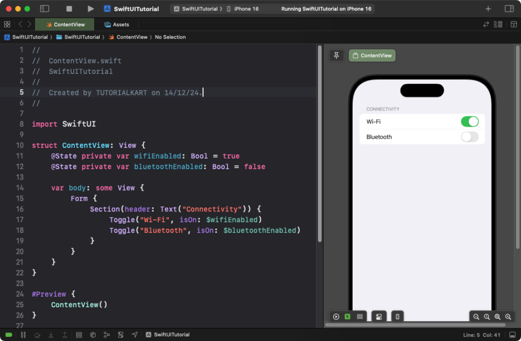
Example 3: Toggle in a Settings-Like Layout
Here’s how you can use toggles in a settings-style layout:
Code Example:
import SwiftUI

struct ContentView: View {
    @State private var wifiEnabled: Bool = true
    @State private var bluetoothEnabled: Bool = false

    var body: some View {
        Form {
            Section(header: Text("Connectivity")) {
                Toggle("Wi-Fi", isOn: $wifiEnabled)
                Toggle("Bluetooth", isOn: $bluetoothEnabled)
            }
        }
    }
}
Explanation:
- The
Formorganizes the toggles into a settings-style layout. - The
Sectiongroups related toggles under a “Connectivity” header. - The
wifiEnabledandbluetoothEnabledstates track the status of the respective toggles.
Result: A settings-style screen with toggles for Wi-Fi and Bluetooth is displayed, grouped under a “Connectivity” header.
Conclusion
The Toggle view in SwiftUI provides an easy and flexible way to create switches for enabling or disabling features. With built-in styles and customization options, toggles can be seamlessly integrated into various app designs, from simple forms to complex settings pages.