SwiftUI – ZStack
In SwiftUI, the ZStack is a layout container that overlays its child views on top of each other along the z-axis. This makes it an essential tool for creating layered designs, such as backgrounds, overlapping views, or complex custom layouts.
In this SwiftUI tutorial, we’ll explore how to use the ZStack, customise its layout, and create visually appealing designs with practical examples.
Basic Syntax for ZStack
The basic syntax for creating a ZStack is:
ZStack(alignment: .center) {
    // Add views here
}
Here:
alignment: Specifies how child views are aligned within theZStack. The default is.center.- The content block contains the views to be overlaid.
Each view inside the ZStack is layered in the order it’s defined, with the first view at the bottom and the last view on top.
Examples
Let’s explore how to use ZStack with practical examples.
Example 1: Simple ZStack
This example demonstrates how to layer multiple views using a ZStack:
Code Example:
import SwiftUI

struct ContentView: View {
    var body: some View {
        ZStack {
            Rectangle()
                .fill(Color.blue)
                .frame(width: 200, height: 200)

            Circle()
                .fill(Color.green)
                .frame(width: 150, height: 150)

            Text("Overlapping Views")
                .font(.headline)
                .foregroundColor(.white)
        }
        .padding()
    }
}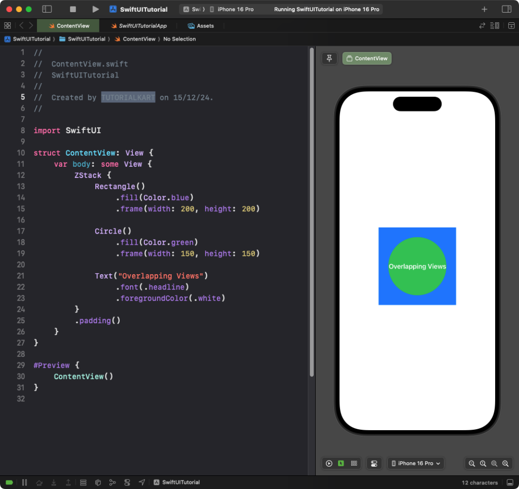
Explanation:
- The
Rectangleis at the bottom, forming the background. - The
Circleis layered on top of the rectangle. - The
Textis on top, making it the frontmost layer.
Result: A rectangle is displayed as the background, with a circle and text layered on top.
Example 2: Aligning Views in ZStack
You can control the alignment of views within a ZStack using the alignment parameter:
Code Example:
import SwiftUI

struct ContentView: View {
    var body: some View {
        ZStack(alignment: .bottomTrailing) {
            Rectangle()
                .fill(Color.gray.opacity(0.3))
                .frame(width: 300, height: 300)

            Text("Aligned Text")
                .padding()
                .background(Color.blue)
                .foregroundColor(.white)
                .cornerRadius(8)
        }
        .padding()
    }
}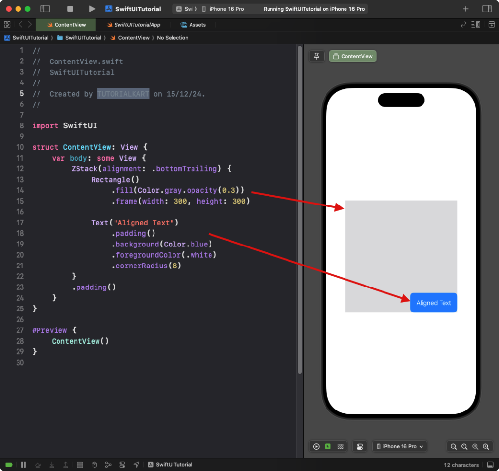
Explanation:
- The
alignment: .bottomTrailingparameter aligns the text to the bottom-right corner of theZStack. - The rectangle provides a background for the layout.
Result: A rectangle is displayed with text aligned to the bottom-right corner.
Example 3: ZStack for Backgrounds
The ZStack is often used to set a background for other views:
Code Example:
import SwiftUI

struct ContentView: View {
    var body: some View {
        ZStack {
            Color.yellow
                .edgesIgnoringSafeArea(.all)

            VStack {
                Text("Hello, World!")
                    .font(.largeTitle)
                    .padding()
                    .background(Color.white)
                    .cornerRadius(10)

                Text("Welcome to SwiftUI!")
                    .padding()
                    .background(Color.white)
                    .cornerRadius(10)
            }
        }
    }
}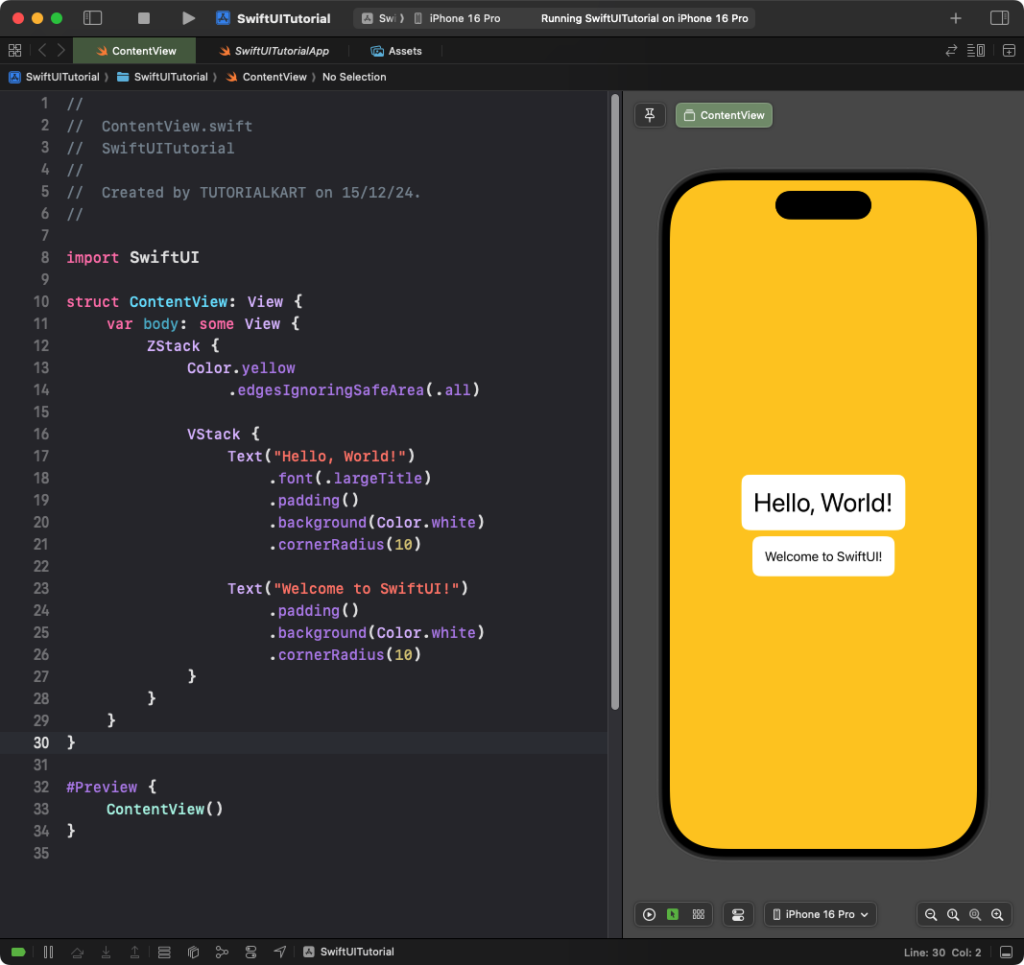
Explanation:
- The
Color.yellowacts as the background for the entire screen, ignoring the safe area. - A
VStackis used inside theZStackto arrange the text views vertically.
Result: A yellow background spans the screen, with text views arranged vertically on top.
Conclusion
The ZStack in SwiftUI is a versatile layout container for layering views. By combining it with alignment, colors, and other layout modifiers, you can create dynamic and visually appealing designs with ease. Whether for backgrounds, overlays, or layered designs, ZStack is an indispensable tool in SwiftUI.