 TutorialKart.com
apex pageblockbuttons Component in Visualforce
The apex:pageBlockButtons component is used in a Visualforce page to create a group of standard Salesforce-style buttons inside an apex:pageblock component. It is commonly used with components such as apex:commandButton to provide actions like Save, Cancel, Edit, Delete, or custom controller actions.
The apex pageblockbuttons component must be placed as a child of <apex:pageBlock>. The buttons can be displayed at the top, bottom, or both positions of the page block by using the location attribute.
Where apex:pageBlockButtons is used in a Visualforce page
Use apex:pageBlockButtons when you want Visualforce buttons to look and behave consistently with the classic Salesforce page block layout. It is useful in edit forms, custom detail pages, approval screens, and pages that use standard or custom controllers.
- It groups related action buttons inside an apex:pageBlock.
- It supports button placement using the location attribute.
- It can contain apex:commandButton, apex:commandLink, and other valid child action components.
- It can be conditionally shown or hidden using the rendered attribute.
- It is mainly used in Visualforce pages that follow the Salesforce Classic-style layout.
apex:pageBlockButtons attributes in Visualforce
The following attributes are commonly used with the apex:pageBlockButtons component.
| Attribute | Description |
|---|---|
| id | Specifies a unique identifier for the pageBlockButtons component in the Visualforce page. |
| location | Specifies where the buttons should be displayed inside the page block. Common values are top, bottom, and both. |
| rendered | A Boolean expression that decides whether the button group should be displayed on the page. |
| dir | Specifies the text direction for the component content, such as left-to-right or right-to-left. |
| style | Adds inline CSS styles to the button group. |
| styleClass | Applies a CSS class to the component. |
| title | Provides advisory text for the component, usually shown as a tooltip by the browser. |
Basic apex:pageBlockButtons syntax
<apex:pageBlock title="Account Form">
    <apex:pageBlockButtons location="both">
        <apex:commandButton value="Save" action="{!save}"/>
        <apex:commandButton value="Cancel" action="{!cancel}"/>
    </apex:pageBlockButtons>
</apex:pageBlock>
In this syntax, the buttons are rendered inside the page block. The value location=”both” displays the same button group at both the top and bottom of the page block.
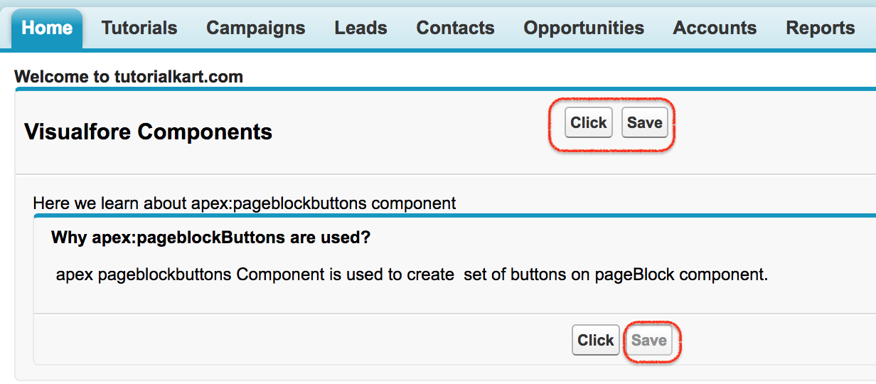
Visualforce page example using apex:pageBlockButtons
<apex:page >
     <h1>Welcome to tutorialkart.com</h1>
    <apex:form>
        <apex:pageBlock title="Visualfore Components">
            <p>Here we learn about apex:pageblockbuttons component</p>
            <apex:pageBlockButtons location="top">
                <apex:commandButton value="Click" action="https://www.tutorialkart.com"/>
                <apex:commandButton value="Save"  action="{!save}" disabled="false"/>
                <br/><br/>
            </apex:pageBlockButtons>
            <apex:pageBlock>
                <apex:pageBlockButtons location="bottom">
                    <apex:commandButton value="Click" action="https://www.tutorialkart.com"/>
                <apex:commandButton value="Save"  action="{!save}" disabled="true" />
                </apex:pageBlockButtons>
                <h2>
                    Why apex:pageblockButtons are used?
                </h2>
                <br/>
                <p>
                     apex pageblockbuttons Component is used to create  set of buttons on pageBlock component.                </p>
            </apex:pageBlock>
        </apex:pageBlock>
    </apex:form>
</apex:page>
How the apex:pageBlockButtons example works
- Every Visualforce page must be started with <apex:page> tag. Apex pageblockbuttons Component must be a child of Apex pageblock component, so we added inside <apex:pageblock> tag.
- Every <apex:CommandButton> must be written inside <apex:form> tag and the tag must be only one.
- We can add location of the buttons as top, bottom and both.
- For command buttons we have added action and enter disabled as “true” in the second block, this disables the function of the button.
The example contains two button groups. The first apex:pageBlockButtons component uses location=”top”, so the buttons are shown at the top of the outer page block. The second one uses location=”bottom”, so the buttons are shown at the bottom of the inner page block.
Output of the apex:pageBlockButtons Visualforce page
Using location attribute in apex:pageBlockButtons
The location attribute controls where the button group appears in the page block. This is one of the most important attributes of apex:pageBlockButtons.
| location value | Result |
|---|---|
| top | Displays the buttons at the top of the page block. |
| bottom | Displays the buttons at the bottom of the page block. |
| both | Displays the buttons at both the top and bottom of the page block. |
<apex:pageBlockButtons location="top">
    <apex:commandButton value="Save" action="{!save}"/>
</apex:pageBlockButtons>

<apex:pageBlockButtons location="bottom">
    <apex:commandButton value="Cancel" action="{!cancel}"/>
</apex:pageBlockButtons>
Conditionally show apex:pageBlockButtons with rendered
The rendered attribute is useful when the button group should be displayed only for a particular condition. For example, you may want to show Save and Cancel buttons only when the page is in edit mode.
<apex:pageBlockButtons location="both" rendered="{!isEditMode}">
    <apex:commandButton value="Save" action="{!save}"/>
    <apex:commandButton value="Cancel" action="{!cancel}"/>
</apex:pageBlockButtons>
In the above syntax, the buttons are displayed only when the controller property isEditMode returns true. If it returns false, the complete button group is not rendered in the HTML output.
Displaying Visualforce messages near pageBlockButtons
Buttons such as Save often perform validation or DML operations. To display success, warning, or error messages returned by the controller, add apex:pageMessages inside the page. This is commonly used with apex:pageBlockButtons so users can see what happened after clicking a button.
<apex:page>
    <apex:form>
        <apex:pageMessages />

        <apex:pageBlock title="Account Details">
            <apex:pageBlockButtons location="both">
                <apex:commandButton value="Save" action="{!save}"/>
                <apex:commandButton value="Cancel" action="{!cancel}"/>
            </apex:pageBlockButtons>
        </apex:pageBlock>
    </apex:form>
</apex:page>
Common mistakes with apex:pageBlockButtons
- Do not place apex:pageBlockButtons directly under apex:page. It should be inside apex:pageBlock.
- Do not use apex:commandButton outside apex:form when the button submits data or calls a controller action.
- Use disabled=”true” only when the button should be visible but not clickable.
- Use rendered=”false” or a Boolean expression when the entire button group should not appear on the page.
- Avoid placing unrelated links or layout markup inside the button group. Keep the component focused on actions.
apex:pageBlockButtons in Visualforce and Lightning experience
Visualforce pages are still used in many Salesforce orgs, especially for existing custom pages, Classic-style layouts, and use cases that depend on Visualforce controllers. However, for new Salesforce UI development, Lightning Web Components are usually preferred. If you maintain an older Visualforce page, apex:pageBlockButtons remains useful for consistent page block actions.
If a page needs a modern Lightning interface, review whether the feature should remain in Visualforce, be embedded with Lightning functionality, or be rebuilt as a Lightning Web Component. The best choice depends on the org, user experience, and maintenance requirements.
FAQ on apex:pageBlockButtons component
What is apex:pageBlockButtons in Visualforce?
apex:pageBlockButtons is a Visualforce component used to group action buttons inside an apex:pageBlock. It helps display buttons in the standard Salesforce page block style.
Can apex:pageBlockButtons be used outside apex:pageBlock?
No. The apex:pageBlockButtons component is intended to be used as a child of apex:pageBlock. Placing it outside a page block is not the correct structure.
Which location values are used in apex:pageBlockButtons?
The commonly used values are top, bottom, and both. These values control whether the buttons appear at the top, bottom, or both positions of the page block.
How do I hide apex:pageBlockButtons conditionally?
Use the rendered attribute with a Boolean expression. For example, rendered=”{!isEditMode}” displays the button group only when isEditMode is true.
Which Visualforce component displays messages after clicking a button?
Use apex:pageMessages or apex:pageMessage to display messages on the Visualforce page. These components are commonly used with Save buttons and controller actions.
Editorial QA checklist for apex:pageBlockButtons tutorial
- Confirm that every apex:pageBlockButtons example is placed inside apex:pageBlock.
- Confirm that examples using apex:commandButton are inside apex:form.
- Check that location values are explained with top, bottom, and both use cases.
- Check that rendered and disabled are explained as different behaviors.
- Verify that Visualforce examples remain relevant for Classic-style Salesforce pages and existing Visualforce maintenance.
Conclusion on apex pageblockbuttons Component
In this Salesforce tutorial, we learned how the Apex pageblockbuttons component is used to add Salesforce-style action buttons inside an apex:pageBlock. We also covered the location attribute, conditional rendering, message display, and common mistakes to avoid. In our next Salesforce tutorial, we will learn about Apex PageBlockSection component.