 TutorialKart.com
Apex pageBlockSectionItem component in Visualforce
Apex pageBlockSectionItem is a Visualforce component used inside an <apex:pageBlockSection> to control how one label-and-value pair is displayed in a Salesforce-styled page block section. It is commonly used when the default layout of <apex:inputField>, <apex:inputText>, or <apex:outputLabel> is not enough and you want to decide what appears in the label cell and what appears in the data cell.
The important rule is simple: an <apex:pageBlockSectionItem> can contain up to two child components. With two child components, the first child is rendered in the left label cell and the second child is rendered in the right data cell. With only one child component, that child spans both cells in the section item.
This component belongs to Salesforce Visualforce page layout, not Oracle APEX page items. In Visualforce, it is mainly a layout component; the actual value binding, validation, and button actions are still handled by components such as <apex:inputText>, <apex:inputField>, <apex:commandButton>, and the Apex controller.
Where apex:pageBlockSectionItem fits inside apex:pageBlockSection
<apex:pageBlockSectionItem> is used as a child of <apex:pageBlockSection>. The parent section controls the number of columns, title, and collapsible behavior. The section item controls the content of a single label/data pair inside those columns. You can read the Salesforce reference for apex:pageBlockSectionItem and the related apex:pageBlockSection component for the full attribute list.
<apex:pageBlockSection columns="1" title="Account Details">
    <apex:pageBlockSectionItem>
        <apex:outputLabel value="Account Name"/>
        <apex:inputText value="{!accountName}"/>
    </apex:pageBlockSectionItem>
</apex:pageBlockSection>
In the syntax above, <apex:outputLabel> is the label-cell component and <apex:inputText> is the data-cell component. This is why <apex:pageBlockSectionItem> is useful when you want more control than the default field label generated by Visualforce.
Apex pageBlockSectionItem child component rules
| Children inside apex:pageBlockSectionItem | How Visualforce renders the item | Common use case |
|---|---|---|
| No child component | No visible label or data content is rendered for that item. | Avoid this because it creates no useful UI. |
| One child component | The child component spans both the label and data cells. | Displaying a message, instruction, or custom text across the section width. |
| Two child components | The first child appears in the label cell and the second child appears in the data cell. | Pairing <apex:outputLabel> with an input or output component. |
| More than two child components | This is not the intended structure for this component. | Wrap related markup in another component only when the layout genuinely requires it. |
Apex pageBlockSectionItem component attributes
The attributes below are the ones beginners usually need when working with <apex:pageBlockSectionItem>. Styling should be used carefully because page block components already follow the classic Salesforce Visualforce page style.
| Attribute | Purpose in apex:pageBlockSectionItem |
|---|---|
| dataStyle | Adds inline CSS styles to the right data cell of the page block section item. |
| dataTitle | Sets title text for the right data cell, usually shown by the browser as tooltip text. |
| dir | Sets the text direction, such as left-to-right or right-to-left. |
| labelStyle | Adds inline CSS styles to the left label cell of the page block section item. |
| labelTitle | Sets title text for the left label cell. |
| rendered | A Boolean expression that decides whether the component is included in the rendered Visualforce page. |
| style | Adds inline CSS to the component wrapper. |
| styleClass | Applies one or more CSS classes to the component wrapper. |
Visualforce calculator example using apex:pageBlockSectionItem
In this Salesforce tutorial, we are going to create a Visualforce page for addition, subtraction, and multiplication using apex pageblocksection and Apex pageBlockSectionItem. The calculator is a simple example, but it clearly shows how each section item can place a label on the left and an input, result, or button on the right.
Visualforce page using pageBlockSectionItem
<apex:page controller="subtraction" sidebar="false" >
    <apex:form >
        <apex:pageBlock title="Calculator">
            <apex:pageBlockSection columns="2" title="Mathematical Operations"
                                   collapsible="false">
            <apex:pageBlockSectionItem >
                <apex:outputLabel >Enter X value </apex:outputLabel>
                <apex:inputText value="{!xvalue}"/>
            </apex:pageBlockSectionItem>
            <apex:pageBlockSectionItem >
                <apex:outputLabel >Enter Y value </apex:outputLabel>
                <apex:inputText value="{!yvalue}"/>
            </apex:pageBlockSectionItem>
            <apex:pageBlockSectionItem >
                <apex:outputLabel >Result </apex:outputLabel>
                <apex:inputText value="{!result}"/>
            </apex:pageBlockSectionItem>
             <apex:pageBlockSectionItem >
             <apex:outputLabel > You have performed {!operation} of {!xvalue} and {!yvalue}.
                    </apex:outputLabel>
            </apex:pageBlockSectionItem>
            <apex:pageBlockSectionItem >
                <apex:commandButton value="Addition" action="{!add}"/>
            </apex:pageBlockSectionItem>
            <apex:pageBlockSectionItem >
                <apex:commandButton value="Subtraction" action="{!sub}"/>
            </apex:pageBlockSectionItem>
            <apex:pageBlockSectionItem >
                <apex:commandButton value="Multiplication" action="{!mul}"/>
            </apex:pageBlockSectionItem>
          </apex:pageBlockSection>
       </apex:pageBlock>
    </apex:form>
</apex:page>
In the Visualforce page above, the controller named subtraction performs addition, subtraction, and multiplication. Apex : CommandButton and Apex:commandLink components must be defined inside Apex:form component because they submit the form and invoke controller actions.
- Add an
<apex:pageBlock>and set the title as Calculator. - Add an
<apex:pageBlockSection>, set the title, and specify the number of columns to display. - Inside each
<apex:pageBlockSectionItem>, add an<apex:outputLabel>first and then the input, result, or button component. - Use a single child component only when the content should span both cells, as shown in the message row.
Apex controller used by the Visualforce calculator
public class subtraction
{
    public Integer xvalue {get;set;}
    public Integer yvalue {get;set;}
    public Integer result {get;set;}
    public string operation {get;set;}

        public pagereference sub()
        {
            result = xvalue-yvalue;
            operation = 'Subtraction';
            return null;
        }
        public pagereference add()
        {
            result = xvalue+yvalue;
            operation = 'Addition';
            return null;
        }
        public pagereference mul()
        {
            result = xvalue*yvalue;
            operation = 'Multiplication';
            return null;
        }

}
The controller exposes four properties to the Visualforce page: xvalue, yvalue, result, and operation. Each command button calls one controller method and returns null, so the same page is refreshed with the updated result.
Calculator pageBlockSectionItem output
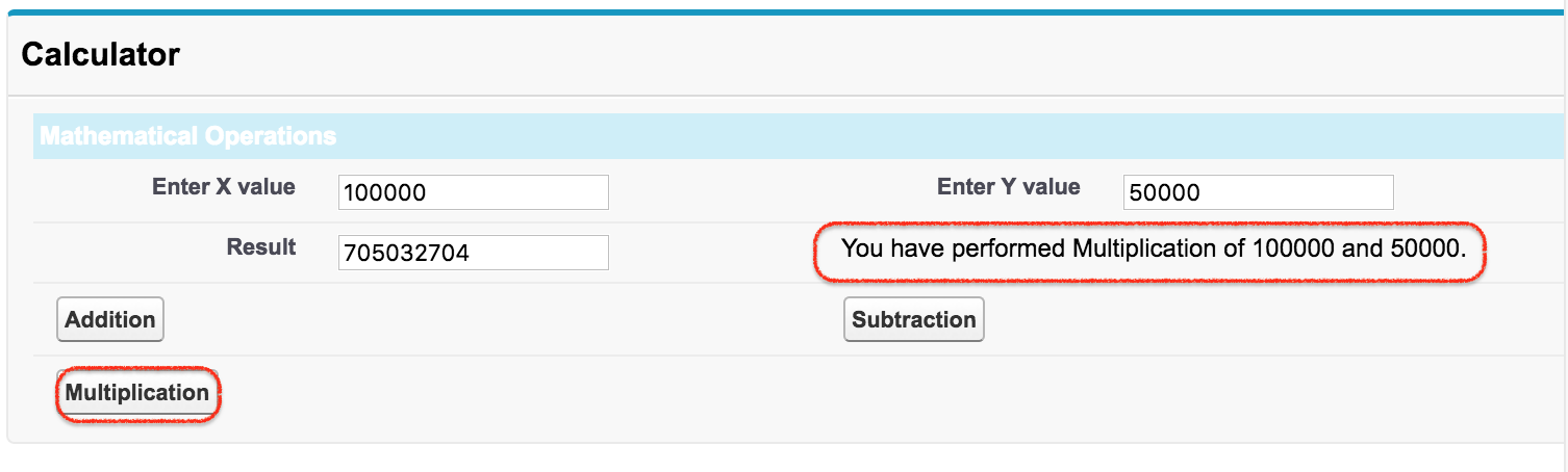
- Enter the X value and Y value in the Visualforce form.
- Click the operation button that you want to perform.
- The result is displayed in the result field and the operation message is displayed in the section item row.
When to use apex:pageBlockSectionItem in Salesforce Visualforce
Use <apex:pageBlockSectionItem> when you want a Visualforce page to keep the standard page block section layout but still control the label and value cells manually. It is useful for custom labels, calculated values, mixed input/output rows, button placement inside a page block section, and conditional rows controlled with the rendered attribute.
If you are only displaying a standard Salesforce field with its normal label, <apex:inputField> inside a page block section may be enough. Use <apex:pageBlockSectionItem> when you need a custom label, a non-field value, or a row that combines multiple Visualforce components in a controlled label/data layout.
Common mistakes with apex:pageBlockSectionItem markup
- Using more than two direct child components: keep the direct children to the label component and the data component. Wrap extra content only when needed.
- Expecting it to save data by itself: this component only controls layout. Data is saved or calculated through bound input components and controller logic.
- Forgetting apex:form around command buttons: command buttons and command links need an
<apex:form>to submit actions. - Misspelling rendered: use
rendered, notrenderd, when conditionally displaying the item. - Confusing pageBlockSectionItem with pageBlockSection: the section creates the grid structure; the section item fills one label/data slot inside that structure.
Apex pageBlockSectionItem FAQ
What is apex:pageBlockSectionItem used for in Visualforce?
<apex:pageBlockSectionItem> is used to define one item inside an <apex:pageBlockSection>. It lets you manually control what appears in the label cell and what appears in the data cell.
How many child components can apex:pageBlockSectionItem contain?
An <apex:pageBlockSectionItem> can contain up to two child components. The first child is treated as label content and the second child is treated as data content. If there is only one child, it spans both cells.
Can apex:pageBlockSectionItem be used outside apex:pageBlockSection?
It is designed to be used inside <apex:pageBlockSection>. Without the parent page block section layout, the label/data cell behavior is not meaningful.
Does apex:pageBlockSectionItem replace apex:inputField?
No. <apex:inputField> is a field input component, while <apex:pageBlockSectionItem> is a layout component. You can place an input component inside a section item when you need a custom label or custom layout.
Can I show or hide apex:pageBlockSectionItem conditionally?
Yes. Use the rendered attribute with a Boolean value or expression from the controller. When the expression is false, the section item is not rendered on the Visualforce page.
QA checklist for this apex:pageBlockSectionItem tutorial
- Confirm that every
<apex:pageBlockSectionItem>example is placed inside<apex:pageBlockSection>. - Check that each section item has no more than two direct child components.
- Verify that command buttons are inside
<apex:form>and call valid Apex controller methods. - Review the spelling of Visualforce attributes such as
rendered,labelStyle, anddataStyle. - Test the calculator page by entering both values and clicking Addition, Subtraction, and Multiplication.