
Flutter CircularProgressIndicator Widget Tutorial
CircularProgressIndicator is a Material Design widget that displays progress with a circular animation. It is commonly shown while a Flutter application loads data, uploads a file, saves changes, or completes another asynchronous task.
Flutter supports two types of circular progress indicators:
- Determinate: Displays measurable progress from
0.0to1.0. - Indeterminate: Displays a continuously rotating indicator when the completion percentage is unknown.
Determinate and Indeterminate CircularProgressIndicator Modes
A determinate CircularProgressIndicator is appropriate when the application can calculate how much work has been completed. For example, a value of 0.25 represents 25% progress, while 1.0 represents completion.
An indeterminate indicator is appropriate when the application knows that a task is running but cannot calculate its remaining duration. To use this mode, omit the value argument.
| Mode | value | Typical use |
|---|---|---|
| Determinate | A number from 0.0 to 1.0 | Uploads, downloads, imports, or multi-step processing |
| Indeterminate | null or omitted | API requests, initial loading, or tasks with an unknown duration |
CircularProgressIndicator Constructor and Useful Properties
The following properties are commonly used to configure a Flutter circular progress indicator:
value: Sets determinate progress between0.0and1.0. Leave it unset for indeterminate progress.color: Sets the foreground color of the indicator.backgroundColor: Sets the color of the unfilled track.strokeWidth: Controls the thickness of the circular track.semanticsLabel: Provides an accessibility description.semanticsValue: Provides an accessible description of the current progress, such as a percentage.
CircularProgressIndicator(
value: 0.65,
color: Colors.blue,
backgroundColor: Colors.blueGrey,
strokeWidth: 5.0,
semanticsLabel: 'File upload progress',
semanticsValue: '65 percent',
)
Determinate CircularProgressIndicator Example in Flutter
The following application displays a determinate indicator when the floating action button is pressed. Its initial value is 0.2, representing 20%. After one second, the value changes to 0.6, representing 60%.
main.dart
import 'package:flutter/material.dart';
void main() {
runApp(MaterialApp(
home: MyApp(),
));
}
class MyApp extends StatefulWidget {
@override
_MyAppState createState() => _MyAppState();
}
class _MyAppState extends State<MyApp> {
Icon fab = Icon(
Icons.refresh,
);
bool showProgress = false;
double progress = 0.2;
void toggleSubmitState() {
setState(() {
showProgress = !showProgress;
});
}
@override
Widget build(BuildContext context) {
return Scaffold(
appBar: AppBar(
title: new Text("Flutter - tutorialkart.com"),
),
body: Center(
child: showProgress
? CircularProgressIndicator(value:progress)
: Text('Click on Refreseh button below', style: TextStyle(fontSize: 20),)),
floatingActionButton: FloatingActionButton(
child: fab,
onPressed: () => setState(() {
showProgress = !showProgress;
if (showProgress) {
Future.delayed(const Duration(milliseconds: 1000), () {
setState(() {
progress = 0.6;
});
});
fab = Icon(
Icons.stop,
);
} else {
fab = Icon(Icons.refresh);
}
}),
),
);
}
}
Output
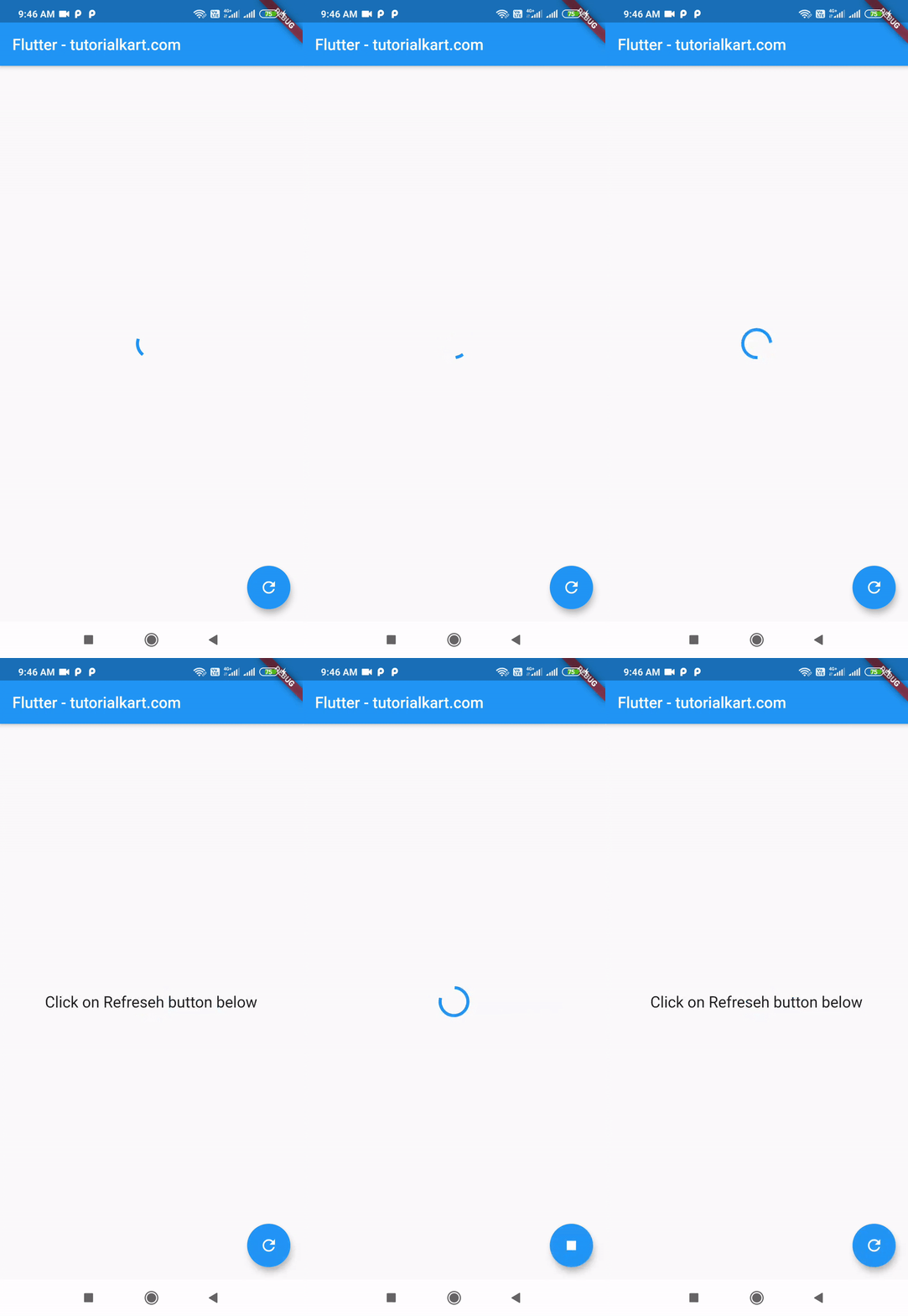
When the indicator is visible, Flutter paints a portion of the circular track according to the current progress value. In a real application, this value would normally come from the upload, download, conversion, or processing operation being monitored.
Update the value through setState() whenever the task reports new progress. When the value reaches 1.0, hide the indicator or replace it with the completed state of the interface.
Indeterminate CircularProgressIndicator Example in Flutter
This example uses CircularProgressIndicator in indeterminate mode. The indicator rotates continuously without displaying a completion percentage.
To enable indeterminate mode, create the widget without supplying a value:
const CircularProgressIndicator()
main.dart
import 'package:flutter/material.dart';
void main() {
runApp(MaterialApp(
home: MyApp(),
));
}
class MyApp extends StatefulWidget {
@override
_MyAppState createState() => _MyAppState();
}
class _MyAppState extends State<MyApp> {
Icon fab = Icon(
Icons.refresh,
);
bool showProgress = true;
void toggleSubmitState() {
setState(() {
showProgress = !showProgress;
});
}
@override
Widget build(BuildContext context) {
return Scaffold(
appBar: AppBar(
title: new Text("Flutter - tutorialkart.com"),
),
body: Center(
child: showProgress
? CircularProgressIndicator()
: Text('Click on Refreseh button below', style: TextStyle(fontSize: 20),)),
floatingActionButton: FloatingActionButton(
child: fab,
onPressed: () => setState(() {
showProgress = !showProgress;
if (showProgress) {
fab = Icon(
Icons.stop,
);
} else {
fab = Icon(Icons.refresh);
}
}),
),
);
}
}
Output

Show CircularProgressIndicator During an Async Task
A common pattern is to store a loading flag in a stateful widget. Set the flag before starting the asynchronous operation and reset it in a finally block so that the indicator is removed even when the operation fails.
bool isLoading = false;
Future<void> loadData() async {
setState(() {
isLoading = true;
});
try {
await Future<void>.delayed(const Duration(seconds: 2));
// Process the response and update the page state here.
} finally {
if (mounted) {
setState(() {
isLoading = false;
});
}
}
}
The loading state can then decide whether the page displays the progress indicator or its normal content.
Center(
child: isLoading
? const CircularProgressIndicator(
semanticsLabel: 'Loading data',
)
: ElevatedButton(
onPressed: loadData,
child: const Text('Load data'),
),
)
Set the Size of a Flutter CircularProgressIndicator
CircularProgressIndicator expands according to the constraints supplied by its parent. Wrap it in a SizedBox when the indicator must have a specific width and height.
const SizedBox(
width: 32,
height: 32,
child: CircularProgressIndicator(
strokeWidth: 3,
),
)
For an indicator placed inside a button, use compact dimensions so that the button does not change size while loading.
ElevatedButton(
onPressed: isLoading ? null : loadData,
child: isLoading
? const SizedBox(
width: 20,
height: 20,
child: CircularProgressIndicator(
strokeWidth: 2,
),
)
: const Text('Submit'),
)
Customize CircularProgressIndicator Color and Stroke Width
Use color for the active arc, backgroundColor for the track, and strokeWidth for the track thickness.
const CircularProgressIndicator(
color: Colors.deepPurple,
backgroundColor: Colors.black12,
strokeWidth: 6,
)
For application-wide styling, configure the progress indicator theme in ThemeData instead of repeating the same values on every widget.
MaterialApp(
theme: ThemeData(
progressIndicatorTheme: const ProgressIndicatorThemeData(
color: Colors.deepPurple,
circularTrackColor: Colors.black12,
),
),
home: const HomePage(),
)
CircularProgressIndicator Accessibility and Loading-State Practices
- Add a meaningful
semanticsLabelwhen the surrounding interface does not already describe the operation. - For determinate progress, update
semanticsValuewith a readable percentage. - Disable buttons that would start the same operation again while it is already running.
- Do not leave an indicator visible after an operation succeeds or fails.
- Avoid blocking the entire page when only one component is loading.
- Display an error message or retry action when the asynchronous operation fails.
Common CircularProgressIndicator Problems
The CircularProgressIndicator does not update
Changing a progress variable does not automatically rebuild a stateful widget. Update the variable inside setState(), or use a state-management mechanism that notifies the interface.
The determinate progress value is incorrect
The value property uses a normalized range rather than a whole percentage. Convert 75% to 0.75 before passing it to the widget.
final double progressValue = completedItems / totalItems;
The indicator causes a layout change
Place the indicator inside a fixed-size SizedBox, especially when swapping it with text or an icon inside a button.
setState is called after the widget is disposed
An asynchronous operation may finish after the user leaves the page. Check mounted before calling setState() after an await.
Flutter CircularProgressIndicator Frequently Asked Questions
How do I make CircularProgressIndicator determinate?
Pass a value between 0.0 and 1.0. For example, value: 0.5 displays 50% progress.
How do I make CircularProgressIndicator indeterminate?
Omit the value property or leave it as null. The indicator will rotate continuously until it is removed from the widget tree.
How do I center a CircularProgressIndicator?
Wrap it in a Center widget. To center it over other content, place the content and indicator in a Stack and use Center for the indicator.
How do I change the CircularProgressIndicator size?
Wrap it in a SizedBox and set the required width and height. Use strokeWidth separately to control the thickness of the track.
Can CircularProgressIndicator display percentage text?
The widget does not draw percentage text itself. Place it in a Stack with a centered Text widget when a visible percentage is required.
Complete CircularProgressIndicator Code on GitHub
You can get the complete code of the Flutter Application used in the above examples at the following link.
Determinate mode: https://github.com/tutorialkart/flutter/tree/master/flutter_circularprogress_d.
Indeterminate mode: https://github.com/tutorialkart/flutter/tree/master/flutter_circularprogress_i.
Flutter CircularProgressIndicator Tutorial Summary
In this Flutter Tutorial, we learned how to use the CircularProgressIndicator widget in determinate and indeterminate modes. We also covered progress values, asynchronous loading states, size constraints, colors, stroke width, accessibility, and common implementation problems.
TutorialKart.com