Flutter TabBar and TabBarView with DefaultTabController
Flutter’s TabBar displays a horizontal set of tabs, while TabBarView displays the page associated with the selected tab. Both widgets must use the same tab controller so that tab taps, swipe gestures, the selected indicator, and the visible page remain synchronized.
This tutorial uses DefaultTabController, which creates and provides a TabController to its descendant widgets. This approach works well when the application has a fixed number of tabs and does not need to control the selected tab directly from code.
How TabBar, TabBarView, and TabController Work Together
A Flutter tab layout normally contains the following parts:
DefaultTabControllercreates the controller and specifies the number of tabs.TabBardisplays the selectable tab labels, icons, and selection indicator.TabBarViewdisplays one child page for each tab.ScaffoldandAppBarprovide the Material page structure used in this example.
The tab count must match in three places: DefaultTabController.length, the number of widgets in TabBar.tabs, and the number of widgets in TabBarView.children. A mismatch causes a runtime assertion.
Flutter TabBar and TabBarView Example
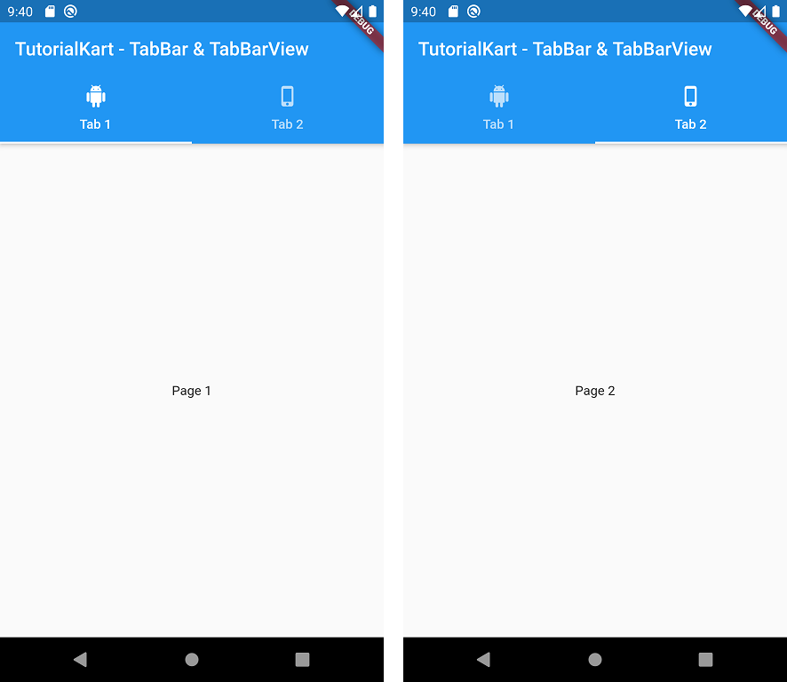
Create a Flutter application and replace lib/main.dart with the following code. The example creates two tabs. Each tab contains an icon and text, and each corresponding page displays centered text.
main.dart
import 'package:flutter/cupertino.dart';
import 'package:flutter/material.dart';
void main() => runApp(MyApp());
class MyApp extends StatelessWidget {
@override
Widget build(BuildContext context) {
return MaterialApp(
title: 'Flutter Demo',
theme: ThemeData(
primarySwatch: Colors.blue,
),
home: MyHomePage(),
);
}
}
class MyHomePage extends StatefulWidget {
@override
_MyHomePageState createState() => _MyHomePageState();
}
class _MyHomePageState extends State<MyHomePage> {
@override
Widget build(BuildContext context) {
return DefaultTabController(
length: 2,
child: Scaffold(
appBar: AppBar(
bottom: TabBar(
tabs: [
Tab(icon: Icon(Icons.android), text: "Tab 1",),
Tab(icon: Icon(Icons.phone_iphone), text: "Tab 2"),
],
),
title: Text('TutorialKart - TabBar & TabBarView'),
),
body: TabBarView(
children: [
Center( child: Text("Page 1")),
Center( child: Text("Page 2")),
],
),
),
);
}
}
What the DefaultTabController Example Does
DefaultTabController(length: 2)creates a controller for exactly two tabs.- The
TabBaris placed inAppBar.bottom, below the app bar title. - Each
Tabuses both an icon and text. A tab may also use only text, only an icon, or a custom child. - The two children in
TabBarViewappear in the same order as the two tabs. - The user can switch pages by tapping a tab or swiping horizontally between the tab views.
Output

Null-Safe Flutter TabBar Example
The original example predates Dart null safety. A current Flutter project can use stateless widgets, const constructors, and the newer theme API while keeping the same DefaultTabController structure.
import 'package:flutter/material.dart';
void main() {
runApp(const TabBarApp());
}
class TabBarApp extends StatelessWidget {
const TabBarApp({super.key});
@override
Widget build(BuildContext context) {
return MaterialApp(
debugShowCheckedModeBanner: false,
title: 'Flutter TabBar Example',
theme: ThemeData(
colorScheme: ColorScheme.fromSeed(seedColor: Colors.blue),
useMaterial3: true,
),
home: const HomeScreen(),
);
}
}
class HomeScreen extends StatelessWidget {
const HomeScreen({super.key});
@override
Widget build(BuildContext context) {
return DefaultTabController(
length: 2,
child: Scaffold(
appBar: AppBar(
title: const Text('Flutter TabBar and TabBarView'),
bottom: const TabBar(
tabs: [
Tab(
icon: Icon(Icons.android),
text: 'Android',
),
Tab(
icon: Icon(Icons.phone_iphone),
text: 'iOS',
),
],
),
),
body: const TabBarView(
children: [
Center(child: Text('Android page')),
Center(child: Text('iOS page')),
],
),
),
);
}
}
A StatefulWidget is not required in this version because DefaultTabController manages the selected tab internally and the screen does not store any other mutable state.
Set the Initial Tab in DefaultTabController
Use initialIndex when the screen should open with a tab other than the first one. Tab indexes start at zero, so initialIndex: 1 selects the second tab.
DefaultTabController(
length: 3,
initialIndex: 1,
child: Scaffold(
appBar: AppBar(
bottom: const TabBar(
tabs: [
Tab(text: 'Overview'),
Tab(text: 'Details'),
Tab(text: 'Reviews'),
],
),
),
body: const TabBarView(
children: [
Center(child: Text('Overview page')),
Center(child: Text('Details page')),
Center(child: Text('Reviews page')),
],
),
),
)
Create Scrollable Tabs in Flutter
A large number of tabs may not fit across the available screen width. Set isScrollable to true so each tab keeps a natural width and the row can scroll horizontally.
const TabBar(
isScrollable: true,
tabs: [
Tab(text: 'News'),
Tab(text: 'Sports'),
Tab(text: 'Technology'),
Tab(text: 'Business'),
Tab(text: 'Science'),
],
)
Keep tab labels concise even when the tab bar is scrollable. Short labels are easier to scan and reduce unnecessary horizontal scrolling.
Customize the Flutter TabBar Indicator and Labels
TabBar provides properties for the selected label, unselected label, indicator thickness, indicator size, indicator padding, and custom indicator decoration.
const TabBar(
indicatorWeight: 3,
indicatorSize: TabBarIndicatorSize.label,
labelStyle: TextStyle(
fontWeight: FontWeight.w600,
),
unselectedLabelStyle: TextStyle(
fontWeight: FontWeight.w400,
),
tabs: [
Tab(text: 'Posts'),
Tab(text: 'Photos'),
],
)
For a fully custom selection indicator, pass a Decoration to the indicator property. Keep the selected and unselected states visually distinguishable.
Disable Swipe Navigation in TabBarView
Users can swipe between TabBarView pages by default. Set physics to NeverScrollableScrollPhysics when page changes should happen only through tab taps or programmatic controller changes.
const TabBarView(
physics: NeverScrollableScrollPhysics(),
children: [
Center(child: Text('First page')),
Center(child: Text('Second page')),
],
)
Use a Custom TabController for Programmatic Tab Changes
Use an explicit TabController when the application needs to change tabs from a button, listen for selection changes, or coordinate tab selection with another animation. The State class uses SingleTickerProviderStateMixin and disposes the controller when the widget is removed.
class ControlledTabs extends StatefulWidget {
const ControlledTabs({super.key});
@override
State<ControlledTabs> createState() => _ControlledTabsState();
}
class _ControlledTabsState extends State<ControlledTabs>
with SingleTickerProviderStateMixin {
late final TabController _tabController;
@override
void initState() {
super.initState();
_tabController = TabController(
length: 2,
vsync: this,
);
_tabController.addListener(() {
if (!_tabController.indexIsChanging) {
debugPrint('Selected tab: ${_tabController.index}');
}
});
}
@override
void dispose() {
_tabController.dispose();
super.dispose();
}
@override
Widget build(BuildContext context) {
return Scaffold(
appBar: AppBar(
title: const Text('Controlled tabs'),
bottom: TabBar(
controller: _tabController,
tabs: const [
Tab(text: 'First'),
Tab(text: 'Second'),
],
),
),
body: TabBarView(
controller: _tabController,
children: const [
Center(child: Text('First page')),
Center(child: Text('Second page')),
],
),
floatingActionButton: FloatingActionButton(
onPressed: () {
_tabController.animateTo(1);
},
child: const Icon(Icons.arrow_forward),
),
);
}
}
The same controller instance must be assigned to both TabBar and TabBarView. Separate controllers will not keep the selected tab and displayed page synchronized.
Keep TabBarView Page State After Switching Tabs
A tab page may contain a scroll position, form values, or loaded data that should remain available after the user switches tabs. For page-specific state, use a StatefulWidget and mix its State class with AutomaticKeepAliveClientMixin.
class SavedTabPage extends StatefulWidget {
const SavedTabPage({super.key});
@override
State<SavedTabPage> createState() => _SavedTabPageState();
}
class _SavedTabPageState extends State<SavedTabPage>
with AutomaticKeepAliveClientMixin {
@override
bool get wantKeepAlive => true;
@override
Widget build(BuildContext context) {
super.build(context);
return ListView.builder(
itemCount: 50,
itemBuilder: (context, index) {
return ListTile(
title: Text('Item ${index + 1}'),
);
},
);
}
}
Call super.build(context) when using AutomaticKeepAliveClientMixin. Retain only the pages whose state needs to persist, because keeping every page alive can increase memory use.
Common Flutter TabBar and TabBarView Errors
TabController Length Does Not Match the Number of Tabs
This error occurs when the controller length differs from either TabBar.tabs.length or TabBarView.children.length. Check all three values whenever tabs are added or removed.
No TabController Found for TabBar
A TabBar without its own controller searches the widget tree for a DefaultTabController. Wrap both the tab bar and tab view with DefaultTabController, or pass the same explicit controller to both widgets.
TabBarView Has Unbounded Height
A TabBarView needs a bounded height. When it is placed inside a Column, wrap it with Expanded so it receives the remaining vertical space.
Column(
children: [
const TabBar(
tabs: [
Tab(text: 'One'),
Tab(text: 'Two'),
],
),
const Expanded(
child: TabBarView(
children: [
Center(child: Text('Page one')),
Center(child: Text('Page two')),
],
),
),
],
)
Tab Content Resets After Switching Tabs
Move persistent values into a State object or an application state-management layer. For page-local scroll and form state, consider AutomaticKeepAliveClientMixin or a PageStorageKey.
Flutter TabBar and TabBarView FAQs
What is the difference between TabBar and TabBarView?
TabBar displays and selects tabs. TabBarView displays the page associated with the selected tab. They share a TabController so their indexes and animations remain synchronized.
Do TabBar and TabBarView need the same number of children?
Yes. The number of Tab widgets, the number of TabBarView children, and the controller length must be equal.
When should I use DefaultTabController?
Use DefaultTabController for a fixed tab layout when the selected index can be managed internally. Use an explicit TabController when code must animate to a tab, listen for changes, or coordinate tab selection with another component.
How do I make Flutter tabs scroll horizontally?
Set isScrollable: true on TabBar. This allows the row of tabs to scroll when the combined tab widths exceed the available screen width.
How do I prevent users from swiping between tabs?
Set physics: NeverScrollableScrollPhysics() on TabBarView. Users can then change pages through the tab bar or an explicit controller action.
Flutter TabBar Implementation Checklist
- The controller length matches the number of
Tabwidgets andTabBarViewchildren. TabBarandTabBarViewuse the sameDefaultTabControlleror explicitTabController.- A custom
TabControlleris disposed in the State object’sdispose()method. TabBarViewreceives bounded height, especially when placed inside aColumn.- Scrollable tabs are enabled when the tab labels do not fit across the screen.
- Selected and unselected tab states remain visually distinguishable.
- Important tab-page state is preserved when users switch between pages.
- Tab labels and icons remain understandable with text scaling and accessibility settings.
Summary of Flutter TabBar and TabBarView
In this Flutter Tutorial, we used TabBar and TabBarView with DefaultTabController, set an initial tab, created scrollable tabs, customized the indicator, disabled swipe navigation, and used an explicit TabController for programmatic selection. The controller length, tab count, and page count must always match.
TutorialKart.com