
Flutter IconButton Tutorial
Flutter IconButton is a Material button that displays an icon and responds to user interaction. It is commonly used for actions such as search, refresh, delete, share, navigation, and opening menus.
You can execute a set of statements when the IconButton is pressed using onPressed property. Also, you get the animations like splash when you click this IconButton, just like a regular button.
If you do not specify onPressed property (not even null), the IconButton is displayed as disabled button.
An enabled IconButton has a non-null callback. Setting onPressed to null disables the button and applies its disabled styling.
You get a visual feedback of a click with a splash. Following video demonstrates the splash when we tap on the IconButton.
You can change many properties like size, color, background shape/color, etc. as shown in the following picture.
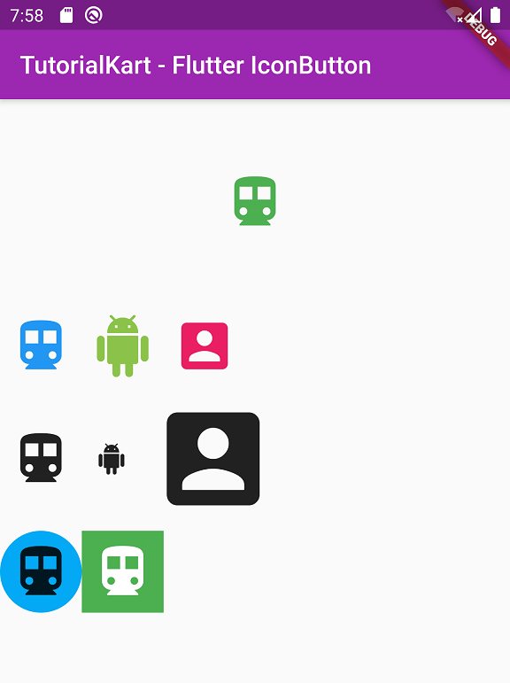
Flutter IconButton Syntax and Important Properties
The icon property supplies the widget displayed inside the button, while onPressed defines the action performed when the user activates it.
IconButton(
icon: const Icon(Icons.search),
tooltip: 'Search',
onPressed: () {
// Handle the button press.
},
)
| IconButton property | Purpose |
|---|---|
icon | The widget displayed as the button icon. |
onPressed | The callback executed when the button is activated. A null value disables the button. |
iconSize | Controls the size of the icon in logical pixels. |
color | Sets the icon color for the enabled state. |
disabledColor | Sets the icon color when the button is disabled. |
tooltip | Provides a text description for hover, long press, and accessibility. |
padding | Controls the space around the icon inside the button. |
constraints | Controls the minimum and maximum dimensions of the button. |
alignment | Positions the icon within the available button area. |
splashRadius | Controls the radius of the circular splash response. |
style | Configures foreground color, background color, padding, shape, size, overlay color, and other Material button states. |
Example – Basic IconButton Example
Following is a simple example of IconButton.
main.dart
import 'package:flutter/material.dart';
void main() => runApp(MyApp());
class MyApp extends StatelessWidget {
@override
Widget build(BuildContext context) {
return MaterialApp(
title: 'TutorialKart - Flutter',
theme: ThemeData(
primarySwatch: Colors.purple,
),
home: MyHomePage(),
);
}
}
class MyHomePage extends StatefulWidget {
@override
_MyHomePageState createState() => _MyHomePageState();
}
class _MyHomePageState extends State<MyHomePage> {
@override
Widget build(BuildContext context) {
return Scaffold(
appBar: AppBar(
title: Text('TutorialKart - Flutter IconButton'),
),
body: Column(children: <Widget>[
Container(
padding: EdgeInsets.all(50),
alignment: Alignment.center,
child: IconButton(
icon: Icon(
Icons.directions_transit,
),
iconSize: 50,
color: Colors.green,
splashColor: Colors.purple,
onPressed: () {},
),
),
]),
);
}
}
Output
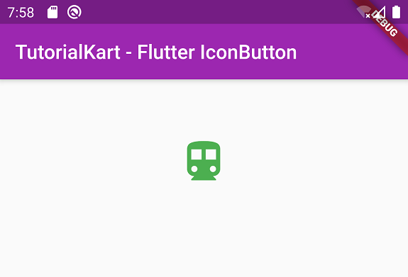
Change Color of IconButton Widget in Flutter
You can change color of IconButton using color property of IconButton class.
IconButton(
icon: Icon(
Icons.directions_transit,
),
color: Colors.green,
onPressed: () {},
),
For buttons that must adapt to the application theme, you can obtain a color from Theme.of(context).colorScheme instead of assigning a fixed color.
IconButton(
icon: const Icon(Icons.favorite),
color: Theme.of(context).colorScheme.primary,
onPressed: () {},
)
Change Size of IconButton Widget in Flutter
You can change the size of IconButton widget, by assigning a specific double value to iconSize property as shown below.
IconButton(
icon: Icon(
Icons.directions_transit,
),
iconSize: 50,
onPressed: () {},
),
Note: Do not change the size in Icon() class. This effects the center of splash and is not recommended.
The visible icon size and the interactive button area are separate concerns. Increasing iconSize enlarges the glyph, while padding, constraints, or the button’s style control the surrounding tap target.
Change Background of IconButton
You can change the background of IconButton by wrapping it around Ink widget as shown below.
Ink(
decoration: const ShapeDecoration(
color: Colors.lightBlue,
shape: CircleBorder(),
),
child: IconButton(
icon: Icon(
Icons.directions_transit,
),
iconSize: 50,
onPressed: () {},
)),
Current Flutter versions also support background and shape configuration through IconButton.styleFrom. This keeps the button’s visual states in one style definition.
IconButton(
icon: const Icon(Icons.directions_transit),
tooltip: 'Transit',
style: IconButton.styleFrom(
backgroundColor: Colors.lightBlue,
foregroundColor: Colors.white,
shape: const CircleBorder(),
),
onPressed: () {},
)
Change Splash Color of IconButton
Splash color is the color that appears like an animated splash when you click the IconButton. You can change the splash color by assigning a Color to splashColor property of IconButton as shown below.
IconButton(
icon: Icon(
Icons.directions_transit,
),
splashColor: Colors.purple,
onPressed: () {},
),
When using the style property, an overlayColor can define the visual response for pressed, hovered, and focused states.
IconButton(
icon: const Icon(Icons.refresh),
style: ButtonStyle(
overlayColor: WidgetStateProperty.resolveWith<Color?>((states) {
if (states.contains(WidgetState.pressed)) {
return Colors.purple.withValues(alpha: 0.20);
}
return null;
}),
),
onPressed: () {},
)
IconButton onPressed
When you click on the IconButton, you can execute a set of statements, by writing them in function of onPressed property as shown below.
IconButton(
icon: Icon(
Icons.directions_transit,
),
onPressed: () {
//statements
print('IconButton is pressed');
},
),
Disable a Flutter IconButton with a Null Callback
Set onPressed to null when the action is unavailable. The button remains in the layout but no longer responds to taps. Use disabledColor or a state-aware style when the default disabled appearance does not fit the interface.
IconButton(
icon: const Icon(Icons.delete),
disabledColor: Colors.grey,
onPressed: null,
)
A common pattern is to enable the button only when the required data is available.
IconButton(
icon: const Icon(Icons.save),
tooltip: 'Save',
onPressed: hasChanges ? saveChanges : null,
)
Add a Tooltip and Accessible Name to Flutter IconButton
An icon may not communicate its purpose clearly to every user. Add a short, action-specific tooltip, especially when the button does not have a visible text label. The tooltip appears after a long press on touch devices and when the pointer hovers over the button on supported platforms.
IconButton(
icon: const Icon(Icons.share),
tooltip: 'Share this article',
onPressed: shareArticle,
)
Use labels that describe the action, such as Delete message or Open settings, rather than labels that only name the icon, such as Trash icon or Gear.
Create a Selected and Unselected Flutter IconButton
An IconButton can represent a toggleable state. Set isSelected and provide selectedIcon when the button should display a different icon after selection.
class FavoriteButton extends StatefulWidget {
const FavoriteButton({super.key});
@override
State<FavoriteButton> createState() => _FavoriteButtonState();
}
class _FavoriteButtonState extends State<FavoriteButton> {
bool isFavorite = false;
@override
Widget build(BuildContext context) {
return IconButton(
icon: const Icon(Icons.favorite_border),
selectedIcon: const Icon(Icons.favorite),
isSelected: isFavorite,
tooltip: isFavorite ? 'Remove from favorites' : 'Add to favorites',
onPressed: () {
setState(() {
isFavorite = !isFavorite;
});
},
);
}
}
The state must be stored outside the IconButton. Pressing the button updates that state and rebuilds the widget with the appropriate icon and tooltip.
Use IconButton in a Flutter AppBar
IconButton widgets are often placed in the actions list of an AppBar. Each button should perform one clear action and include a tooltip.
AppBar(
title: const Text('Messages'),
actions: [
IconButton(
icon: const Icon(Icons.search),
tooltip: 'Search messages',
onPressed: openSearch,
),
IconButton(
icon: const Icon(Icons.more_vert),
tooltip: 'More options',
onPressed: openMenu,
),
],
)
Flutter IconButton Padding, Constraints, and Tap Area
The icon’s visible size is not the same as the button’s interactive area. A small glyph can still have sufficient padding around it, while removing padding and constraints can make a button difficult to activate.
IconButton(
icon: const Icon(Icons.close),
iconSize: 20,
padding: const EdgeInsets.all(12),
constraints: const BoxConstraints(
minWidth: 44,
minHeight: 44,
),
tooltip: 'Close',
onPressed: closePanel,
)
Compact buttons may be suitable in dense desktop layouts, but preserve a usable interactive area for touch interfaces. Test the button on the actual target platforms instead of judging it only by the icon’s dimensions.
Theme Multiple Flutter IconButtons Consistently
Use IconButtonTheme or ThemeData.iconButtonTheme when multiple buttons should share the same colors, padding, shape, or state styling. A local theme affects only its descendants.
IconButtonTheme(
data: IconButtonThemeData(
style: IconButton.styleFrom(
foregroundColor: Colors.indigo,
backgroundColor: Colors.indigo.shade50,
shape: const CircleBorder(),
),
),
child: Row(
mainAxisSize: MainAxisSize.min,
children: [
IconButton(
icon: const Icon(Icons.edit),
tooltip: 'Edit',
onPressed: editItem,
),
IconButton(
icon: const Icon(Icons.delete),
tooltip: 'Delete',
onPressed: deleteItem,
),
],
),
)
Choose Between Icon, IconButton, and TextButton in Flutter
| Flutter widget | Use it when |
|---|---|
Icon | You only need to display a non-interactive glyph. |
IconButton | The icon represents an action and needs tap, keyboard, focus, hover, tooltip, disabled-state, and Material feedback behavior. |
TextButton.icon | The action needs both an icon and a visible text label. |
FilledButton.icon | The icon-and-label action needs stronger visual emphasis and a filled background. |
Avoid placing a bare Icon inside GestureDetector when standard button behavior is required. IconButton already provides Material interaction, focus handling, keyboard activation, button semantics, and disabled-state support.
Complete Code in GitHub
You can get the complete code of the Flutter Application used in the above examples at the following link.
https://github.com/tutorialkart/flutter/tree/master/flutter_iconbutton_tutorial.
Flutter IconButton Questions
How do I disable an IconButton in Flutter?
Set its onPressed callback to null. Flutter then prevents interaction and applies the button’s disabled appearance.
How do I add a background color to a Flutter IconButton?
Set backgroundColor through IconButton.styleFrom or another ButtonStyle. An Ink widget with a ShapeDecoration can also be used in older layouts.
Why does my Flutter IconButton not respond when pressed?
Check that onPressed is not null and that another widget is not covering or absorbing pointer events. Also verify that the button has usable layout constraints and is not outside the visible area.
How do I change both the icon and background when selected?
Use isSelected with selectedIcon, then supply state-aware foreground and background colors through the button’s style.
Should every Flutter IconButton have a tooltip?
A tooltip is recommended when the action is not already identified by nearby visible text. Use a concise action label that explains what activating the button will do.
Flutter IconButton Editorial QA Checklist
- Confirm every enabled
IconButtonhas a non-null callback that performs the intended action. - Check that unavailable actions use
onPressed: nullinstead of an empty callback. - Verify icon-only actions have clear, action-specific tooltips.
- Test foreground, background, disabled, hover, focus, and pressed-state colors in light and dark themes.
- Confirm the button retains a usable tap area after changing
iconSize, padding, or constraints. - Check selected buttons update
isSelected,selectedIcon, and tooltip text consistently. - Verify AppBar IconButtons remain visible and correctly aligned on the supported screen sizes.
Flutter IconButton Widget Summary
A Flutter IconButton combines an icon with Material button interaction. Use onPressed for the action, iconSize for the glyph size, style for state-aware colors and shapes, and tooltip for a clear accessible description. Set the callback to null to disable the button, and use isSelected with selectedIcon for toggleable actions. In this Flutter Tutorial, we covered IconButton usage with examples for common interface requirements.
TutorialKart.com