
Flutter Tooltip Widget

In Flutter, the Tooltip widget displays a short text label that describes the purpose of a button, icon, or other interface element. It is particularly useful when an action is represented only by an icon and its meaning may not be immediately clear.

A tooltip typically appears when the user long-presses its child on a touch device or hovers over it with a mouse pointer on desktop and web platforms. Flutter renders the message as a temporary floating label near the associated widget.

Tooltips improve usability and can provide an accessible text description for visually represented actions. The tooltip message should be brief, specific, and focused on what the control does.

Flutter Tooltip Basic Syntax

Wrap the widget that needs a description with Tooltip and provide the label through the required message property.

</>
Copy
Tooltip(
  message: 'Tooltip message',
  child: YourWidget(),
)

The wrapped widget becomes the tooltip’s child. Flutter handles the appropriate hover or long-press interaction for the current platform.

Flutter Tooltip Example with an Icon Button

To provide tooltip for a button, surround the button with Tooltip.

In this example application, we take a FlatButton with Icon as child, i.e., a visual object. We shall surround this button with Tooltip. So, if you long press on this button, you will see a label with the message provided for Tooltip widget.

main.dart

</>
Copy
import 'package:flutter/material.dart';

void main() {
  runApp(MyApp());
}

class MyApp extends StatefulWidget {
  @override
  _MyAppState createState() => _MyAppState();
}

class _MyAppState extends State<MyApp> {
  @override
  Widget build(BuildContext context) {
    return MaterialApp(
      home: Scaffold(
          appBar: AppBar(
            title: Text('Flutter Tooltip - tutorialkart.com'),
          ),
          body: Center(
              child: Column(children: <Widget>[
            Container(
              margin: EdgeInsets.all(10),
              child: Tooltip(
                message: 'My Account',
                child: FlatButton(
                  child: Icon(
                    Icons.account_box,
                    size: 50,
                  ),
              )),
            ),
          ]))),
    );
  }
}

Long press on the icon to show tooltip.
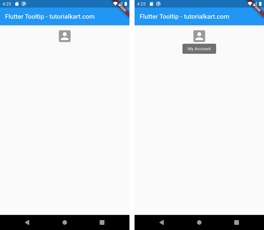
Flutter Tooltip

Note: The example above uses FlatButton, which belongs to Flutter’s older button API. For current Flutter applications, use a modern button such as IconButton, TextButton, or ElevatedButton.

Modern Flutter Tooltip Example Using IconButton

The following example wraps an IconButton with a Tooltip. When the tooltip is displayed, the message Open account appears near the account icon.

</>
Copy
import 'package:flutter/material.dart';

void main() {
  runApp(const MyApp());
}

class MyApp extends StatelessWidget {
  const MyApp({super.key});

  @override
  Widget build(BuildContext context) {
    return MaterialApp(
      debugShowCheckedModeBanner: false,
      home: Scaffold(
        appBar: AppBar(
          title: const Text('Flutter Tooltip Example'),
        ),
        body: Center(
          child: Tooltip(
            message: 'Open account',
            child: IconButton(
              icon: const Icon(Icons.account_box, size: 50),
              onPressed: () {
                ScaffoldMessenger.of(context).showSnackBar(
                  const SnackBar(content: Text('Account button pressed')),
                );
              },
            ),
          ),
        ),
      ),
    );
  }
}

The Tooltip supplies the descriptive label, while the IconButton continues to handle the button action through its onPressed callback.

Using the Built-in IconButton Tooltip Property

IconButton has its own tooltip property. Use it when you only need a standard text tooltip and do not require the additional configuration available from a separate Tooltip widget.

</>
Copy
IconButton(
  tooltip: 'Delete item',
  icon: const Icon(Icons.delete),
  onPressed: () {
    // Delete the item.
  },
)

A separate Tooltip widget is more suitable when the child is not an IconButton or when you need to customize timing, position, decoration, text style, or trigger behavior.

Customizing a Flutter Tooltip

The Tooltip widget provides properties for controlling when the message appears and how it is displayed. Commonly used properties include:

  • message: Specifies the plain-text description shown in the tooltip.
  • richMessage: Displays styled text using an InlineSpan instead of a plain string.
  • height: Sets the minimum height of the tooltip.
  • padding: Adds space around the tooltip text.
  • margin: Adds space around the tooltip container.
  • verticalOffset: Controls the distance between the tooltip and its child.
  • preferBelow: Indicates whether Flutter should place the tooltip below the child when space permits.
  • waitDuration: Sets the delay before a hover-triggered tooltip appears.
  • showDuration: Sets how long the tooltip remains visible after it is triggered.
  • triggerMode: Determines whether the tooltip is activated by long press, tap, or manual control.
  • decoration: Customizes the tooltip background and border.
  • textStyle: Customizes the message’s text appearance.

This example changes the tooltip’s spacing, position, colors, and display timing.

</>
Copy
Tooltip(
  message: 'Add to favorites',
  waitDuration: const Duration(milliseconds: 500),
  showDuration: const Duration(seconds: 2),
  verticalOffset: 24,
  preferBelow: false,
  padding: const EdgeInsets.symmetric(
    horizontal: 12,
    vertical: 8,
  ),
  decoration: BoxDecoration(
    color: Colors.blueGrey.shade900,
    borderRadius: BorderRadius.circular(6),
  ),
  textStyle: const TextStyle(
    color: Colors.white,
    fontSize: 14,
  ),
  child: IconButton(
    icon: const Icon(Icons.favorite_border),
    onPressed: () {},
  ),
)

Showing a Flutter Tooltip Programmatically

Set triggerMode to TooltipTriggerMode.manual when the tooltip should be opened by application logic instead of the default pointer or touch interaction. Assign a GlobalKey<TooltipState> and call ensureTooltipVisible() through the key.

</>
Copy
class ManualTooltipExample extends StatefulWidget {
  const ManualTooltipExample({super.key});

  @override
  State<ManualTooltipExample> createState() =>
      _ManualTooltipExampleState();
}

class _ManualTooltipExampleState
    extends State<ManualTooltipExample> {
  final GlobalKey<TooltipState> tooltipKey =
      GlobalKey<TooltipState>();

  @override
  Widget build(BuildContext context) {
    return Column(
      mainAxisSize: MainAxisSize.min,
      children: [
        Tooltip(
          key: tooltipKey,
          message: 'This tooltip was opened manually',
          triggerMode: TooltipTriggerMode.manual,
          child: const Icon(Icons.info_outline, size: 40),
        ),
        const SizedBox(height: 16),
        ElevatedButton(
          onPressed: () {
            tooltipKey.currentState?.ensureTooltipVisible();
          },
          child: const Text('Show tooltip'),
        ),
      ],
    );
  }
}

Writing Useful Tooltip Messages in Flutter

A tooltip should explain the action or meaning of its child without forcing the user to interpret the icon. Follow these practical guidelines:

  • Use a short action label such as Search, Share article, or Delete item.
  • Avoid vague labels such as Button, Click here, or More when a more precise description is available.
  • Do not place essential instructions only inside a tooltip because tooltips are temporary and may not be discovered by every user.
  • Keep the tooltip consistent with the action performed by the child widget.
  • Verify that the label remains understandable when read without surrounding visual context.

Flutter Tooltip Frequently Asked Questions

How do I show a tooltip in Flutter?

Wrap a widget with Tooltip, set its message, and place the original widget in the child property. Flutter then shows the message using the interaction appropriate for the platform.

Why does a Flutter tooltip appear on long press?

Long press is the standard tooltip interaction on touch devices because those devices do not have a persistent mouse-hover state. On desktop and web platforms, tooltips can appear when the pointer hovers over the child.

Can a Flutter tooltip open when the child is tapped?

Yes. Set triggerMode to TooltipTriggerMode.tap. Use this behavior carefully so the tooltip interaction does not conflict with the child’s primary tap action.

What is the difference between message and richMessage?

message accepts a plain String. richMessage accepts an InlineSpan, such as TextSpan, and can display differently styled portions of text. Provide only one of these properties for a tooltip.

Should every Flutter icon have a tooltip?

Icons whose purpose may be unclear should have a concise descriptive label. A tooltip is especially useful for icon-only actions, but it should supplement rather than replace visible text when the information is essential.

Flutter Tooltip Summary

In this Flutter Tutorial, we learned how to wrap a widget with Tooltip, display a descriptive message for an icon button, customize the tooltip’s appearance and timing, and show it programmatically. Clear tooltip labels make icon-based controls easier to understand and use.