
Flutter TextField
The Flutter TextField widget accepts text input from the user. It displays an editable Material Design text box, receives focus when tapped, and normally opens the device keyboard.
You can read the entered text with a TextEditingController or respond to each edit through the onChanged callback. A controller is useful when you need to read, replace, clear, or prefill the value from another part of the widget.
Flutter TextField Basic Syntax
TextField(
controller: textController,
decoration: const InputDecoration(
labelText: 'Name',
border: OutlineInputBorder(),
),
onChanged: (value) {
// Respond to the latest text.
},
)
The most commonly used TextField properties are:
controller: connects aTextEditingControllerto the field.decoration: configures the label, hint, border, icons, helper text, and error text.onChanged: runs whenever the text changes.onSubmitted: runs when the user submits the value from the keyboard.keyboardType: requests a suitable keyboard, such as text, number, email, or phone.obscureText: hides characters in fields such as password inputs.maxLinesandminLines: control whether the field is single-line or multiline.readOnlyandenabled: prevent editing or disable the field.
Flutter TextField Example with onChanged
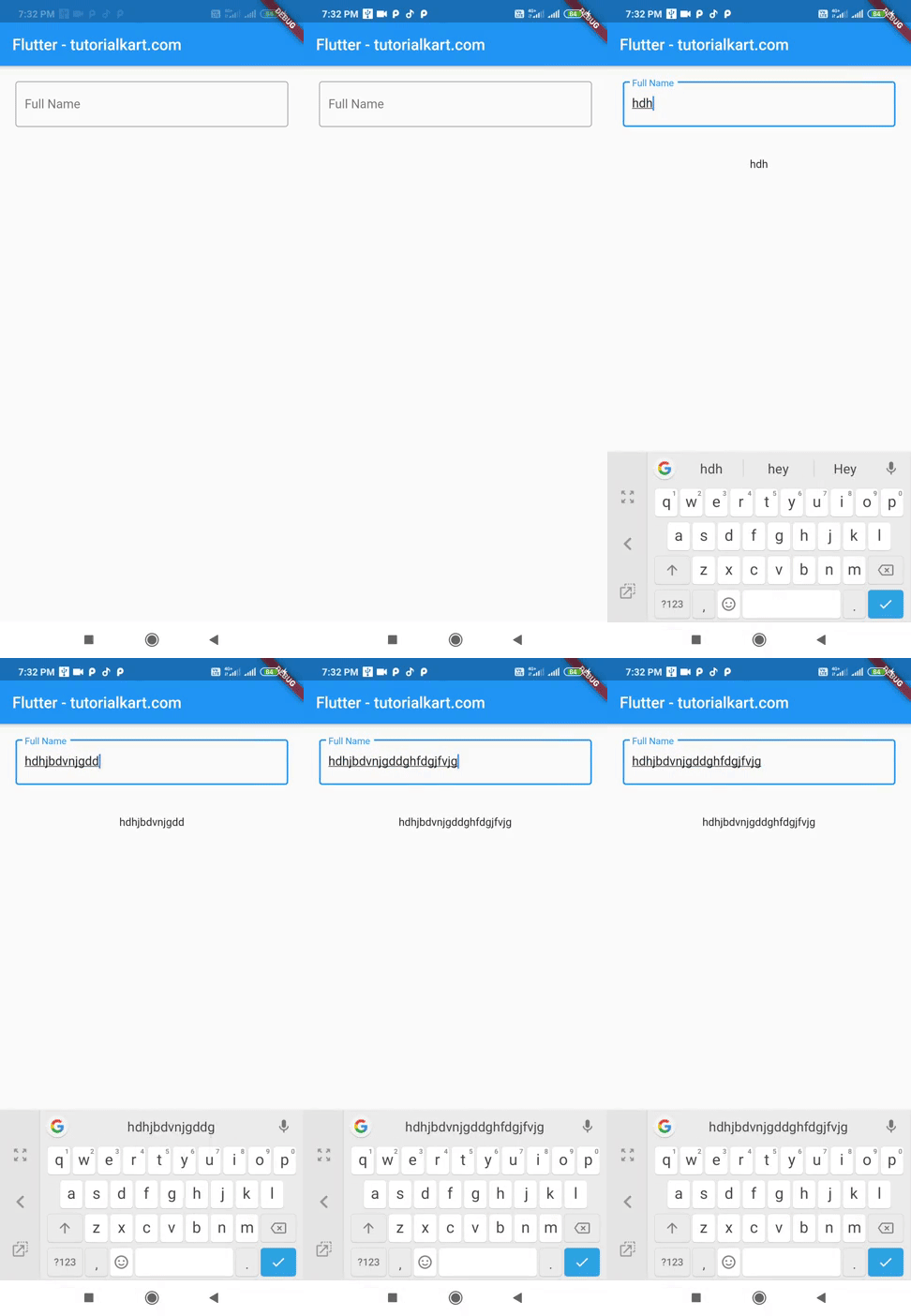
In this example, the TextField uses a controller and an onChanged callback. Every time the user edits the field, setState() stores the latest value in fullName. The Text widget below the field is then rebuilt with that value.
The same value is also available through nameController.text.
main.dart
import 'package:flutter/material.dart';
void main() {
runApp(MyApp());
}
class MyApp extends StatefulWidget {
@override
_MyAppState createState() => _MyAppState();
}
class _MyAppState extends State<MyApp> {
TextEditingController nameController = TextEditingController();
String fullName = '';
@override
Widget build(BuildContext context) {
return MaterialApp(
home: Scaffold(
appBar: AppBar(
title: Text('Flutter - tutorialkart.com'),
),
body: Center(child: Column(children: <Widget>[
Container(
margin: EdgeInsets.all(20),
child: TextField(
controller: nameController,
decoration: InputDecoration(
border: OutlineInputBorder(),
labelText: 'Full Name',
),
onChanged: (text) {
setState(() {
fullName = text;
//you can access nameController in its scope to get
// the value of text entered as shown below
//fullName = nameController.text;
});
},
)),
Container(
margin: EdgeInsets.all(20),
child: Text(fullName),
)
]))),
);
}
}
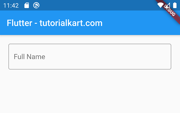
When you run this Flutter application in Android Emulator (or any device running iOS), you should get a TextField as shown below.
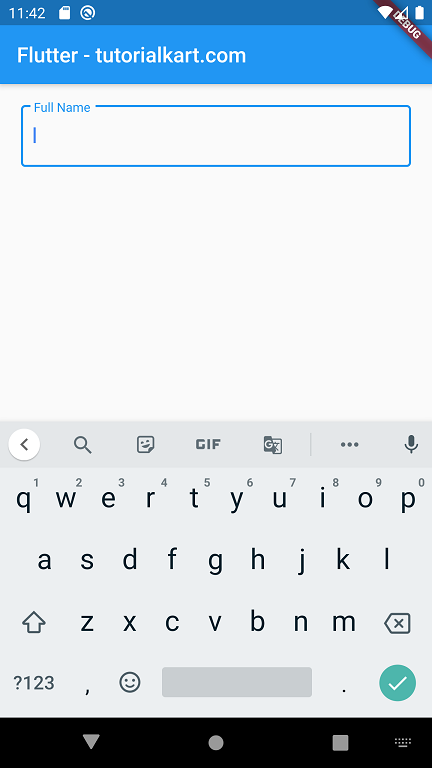
This is a material design component. When you click on the text field, the label goes into the top left corner of the border and a keyboard appears from the bottom of the screen as shown in the below screenshot.
Following GIF demonstrates how we can access the text entered in TextField by displaying it again using a Text widget.
Read, Prefill, and Clear TextField with TextEditingController
A TextEditingController gives programmatic access to the field. Assign initial text before the field is built, read the current text when a button is pressed, or call clear() to empty the field.
class _ProfilePageState extends State<ProfilePage> {
final TextEditingController nameController =
TextEditingController(text: 'Taylor');
void printName() {
debugPrint(nameController.text);
}
void clearName() {
nameController.clear();
}
@override
void dispose() {
nameController.dispose();
super.dispose();
}
@override
Widget build(BuildContext context) {
return Column(
children: [
TextField(
controller: nameController,
decoration: const InputDecoration(
labelText: 'Full Name',
border: OutlineInputBorder(),
),
),
ElevatedButton(
onPressed: printName,
child: const Text('Read Name'),
),
TextButton(
onPressed: clearName,
child: const Text('Clear'),
),
],
);
}
}
Dispose of a controller created by a state object when that state is removed. This releases the resources used by the controller and its listeners.
Configure TextField Keyboard, Capitalization, and Submission
Input-related properties help the keyboard match the expected value. The following field requests an email keyboard, disables automatic capitalization, moves focus to the next input when submitted, and limits the value to one line.
TextField(
keyboardType: TextInputType.emailAddress,
textCapitalization: TextCapitalization.none,
textInputAction: TextInputAction.next,
maxLines: 1,
autocorrect: false,
decoration: const InputDecoration(
labelText: 'Email address',
hintText: 'name@example.com',
prefixIcon: Icon(Icons.email_outlined),
border: OutlineInputBorder(),
),
onSubmitted: (value) {
debugPrint('Submitted: $value');
},
)
keyboardType is a keyboard request rather than input validation. For example, requesting a number keyboard does not by itself guarantee that the saved value is a valid number. Validate or format the input separately when the accepted format matters.
Create Password and Multiline Flutter TextFields
Set obscureText to hide password characters. For notes, comments, or descriptions, provide multiple lines with minLines and maxLines.
Column(
children: [
const TextField(
obscureText: true,
enableSuggestions: false,
autocorrect: false,
decoration: InputDecoration(
labelText: 'Password',
border: OutlineInputBorder(),
),
),
const SizedBox(height: 16),
const TextField(
minLines: 3,
maxLines: 6,
keyboardType: TextInputType.multiline,
decoration: InputDecoration(
labelText: 'Notes',
alignLabelWithHint: true,
border: OutlineInputBorder(),
),
),
],
)
TextField versus TextFormField for Validation
Use TextField for direct text entry when form-level validation is not required. Use TextFormField inside a Form when you need a validator, coordinated validation across multiple fields, or form saving and resetting.
final formKey = GlobalKey<FormState>();
Form(
key: formKey,
child: Column(
children: [
TextFormField(
decoration: const InputDecoration(
labelText: 'Full Name',
border: OutlineInputBorder(),
),
validator: (value) {
if (value == null || value.trim().isEmpty) {
return 'Enter your full name';
}
return null;
},
),
ElevatedButton(
onPressed: () {
if (formKey.currentState!.validate()) {
// Continue with valid input.
}
},
child: const Text('Submit'),
),
],
),
)
Flutter TextField Focus and Keyboard Control
A FocusNode can request focus from code. Calling unfocus() removes focus and usually dismisses the on-screen keyboard.
final FocusNode nameFocusNode = FocusNode();
// Give focus to the TextField.
nameFocusNode.requestFocus();
// Remove focus and dismiss the keyboard.
FocusManager.instance.primaryFocus?.unfocus();
When a state object owns a FocusNode, dispose of it in the state’s dispose() method, just as you would dispose of a TextEditingController.
Common Flutter TextField Issues
- The displayed value does not update: update state in
onChanged, use a controller listener, or use another state-management approach that rebuilds the dependent widget. - The controller loses its text: do not create a new controller inside
build(). Keep it as a state field so rebuilding the widget does not replace it. - The keyboard covers the field: use a scrollable layout where appropriate and let the scaffold resize for the keyboard.
- The field accepts unwanted characters: add suitable input formatters and still validate the final value.
- A read-only field looks disabled: use
readOnly: truewhen the value should remain selectable and interactive, andenabled: falsewhen the whole field should be disabled.
Flutter TextField Questions
How do I get the value from a Flutter TextField?
Attach a TextEditingController and read controller.text, or use the value supplied to onChanged or onSubmitted.
How do I set an initial value in TextField?
Create the controller with initial text, such as TextEditingController(text: 'Initial value'), and assign that controller to the field.
How do I make a Flutter TextField read-only?
Set readOnly: true. The user cannot edit the value, but the field can still receive taps and allow text selection unless other properties prevent those actions.
How do I limit the number of characters in TextField?
Set the maxLength property for a character limit. Use input formatters when you also need to restrict the allowed character pattern.
Flutter TextField Tutorial Summary
In this Flutter Tutorial, we learned how to display a TextField, read its value with onChanged and TextEditingController, configure common input behaviors, manage focus, and choose TextFormField when validation is required.
TutorialKart.com