 TutorialKart.com
Flutter Table
Flutter Table widget can be used to display items in a table layout.
Flutter Table widget has properties like border, columnWidths, textDirection, etc., that help us to enhance or modify the look of the table layout.
Example – Flutter Table
In this example Flutter Application, we shall display some Icons and Row widgets in a table layout.
main.dart
import 'package:flutter/material.dart';

void main() {
  runApp(MyApp());
}

class MyApp extends StatefulWidget {
  @override
  _MyAppState createState() => _MyAppState();
}

class _MyAppState extends State<MyApp> {
  double iconSize = 40;
  @override
  Widget build(BuildContext context) {
    return MaterialApp(
      home: Scaffold(
          appBar: AppBar(
            title: Text('Flutter Table - tutorialkart.com'),
          ),
          body: Center(
              child: Column(children: <Widget>[
            Container(
              margin: EdgeInsets.all(10),
              child: Table(
                border: TableBorder.all(),
                children: [
                  TableRow( children: [
                    Column(children:[
                      Icon(Icons.account_box, size: iconSize,),
                      Text('My Account')
                    ]),
                    Column(children:[
                      Icon(Icons.settings, size: iconSize,),
                      Text('Settings')
                    ]),
                    Column(children:[
                      Icon(Icons.lightbulb_outline, size: iconSize,),
                      Text('Ideas')
                    ]),
                  ]),
                  TableRow( children: [
                    Icon(Icons.cake, size: iconSize,),
                    Icon(Icons.voice_chat, size: iconSize,),
                    Icon(Icons.add_location, size: iconSize,),
                  ]),
                ],
              ),
            ),
          ]))),
    );
  }
}
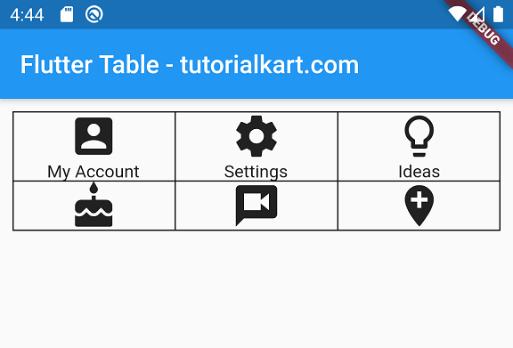
Run this application in an Android Emulator and you may get an UI as shown below. If you notice, we have mentioned the border for Table widget, hence border is displayed. You can remove the property to not display the border.
Example – Table Widget with Different Column Widths
You can specify different column widths. In this example, we display the same items that we used in the previous example, in a table layout, but with different widths.
main.dart
import 'package:flutter/material.dart';

void main() {
  runApp(MyApp());
}

class MyApp extends StatefulWidget {
  @override
  _MyAppState createState() => _MyAppState();
}

class _MyAppState extends State<MyApp> {
  double iconSize = 40;
  @override
  Widget build(BuildContext context) {
    return MaterialApp(
      home: Scaffold(
          appBar: AppBar(
            title: Text('Flutter Table - tutorialkart.com'),
          ),
          body: Center(
              child: Column(children: <Widget>[
            Container(
              margin: EdgeInsets.all(10),
              child: Table(
                border: TableBorder.all(),
                columnWidths: {0: FractionColumnWidth(.4), 1: FractionColumnWidth(.2), 2: FractionColumnWidth(.4)},
                children: [
                  TableRow( children: [
                    Column(children:[
                      Icon(Icons.account_box, size: iconSize,),
                      Text('My Account')
                    ]),
                    Column(children:[
                      Icon(Icons.settings, size: iconSize,),
                      Text('Settings')
                    ]),
                    Column(children:[
                      Icon(Icons.lightbulb_outline, size: iconSize,),
                      Text('Ideas')
                    ]),
                  ]),
                  TableRow( children: [
                    Icon(Icons.cake, size: iconSize,),
                    Icon(Icons.voice_chat, size: iconSize,),
                    Icon(Icons.add_location, size: iconSize,),
                  ]),
                ],
              ),
            ),
          ]))),
    );
  }
}
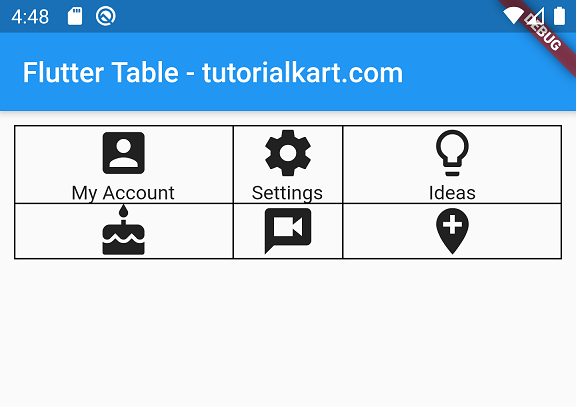
Run this application, and you may get an UI as shown below, with first and third columns taking 40% width each and second column taking 20%.
Conclusion
In this Flutter Tutorial, we learned how to display items in a table layout using Table widget.